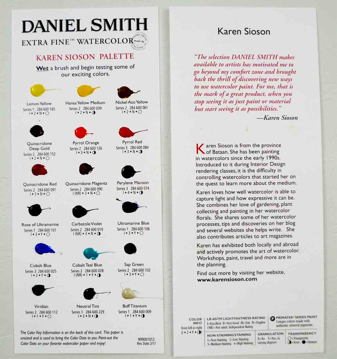
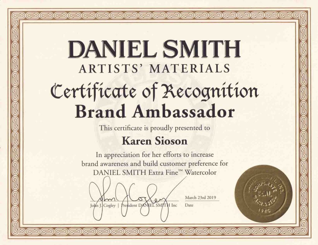
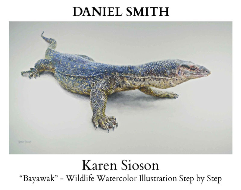
Karen Sioson Palette by DANIEL SMITH

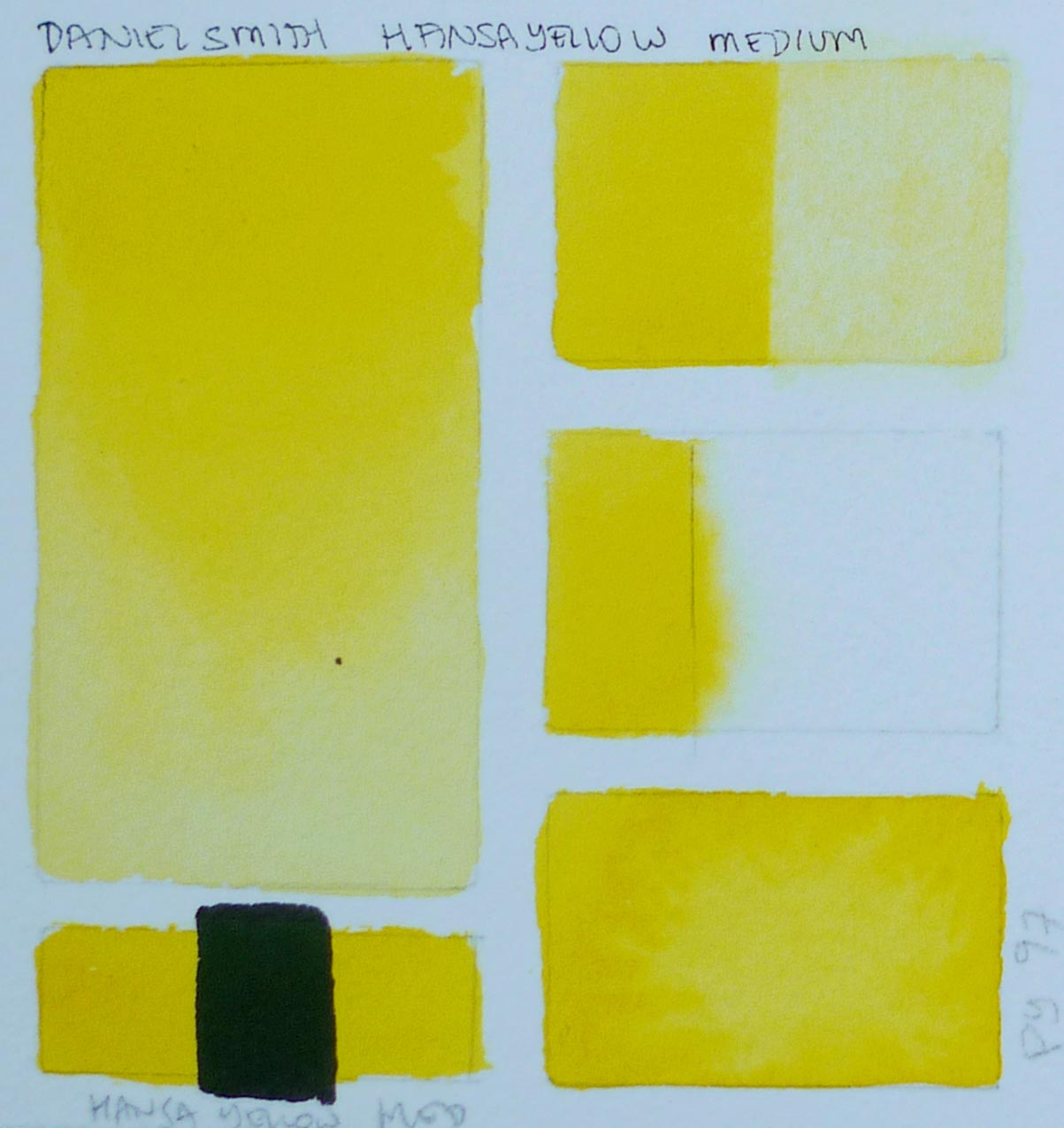
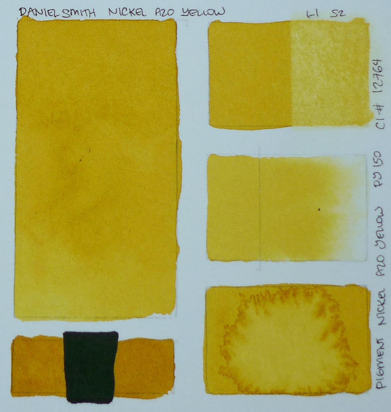
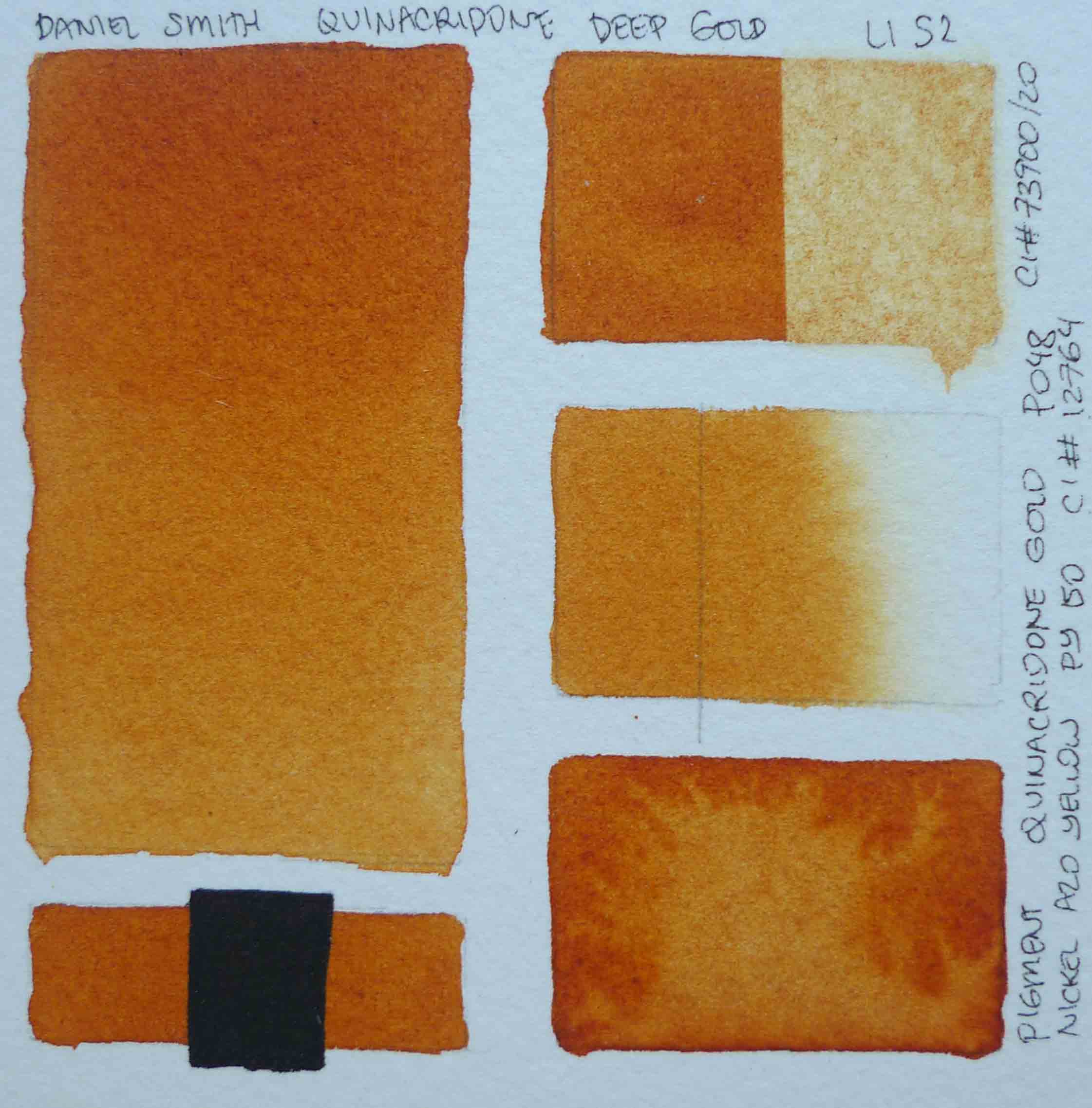
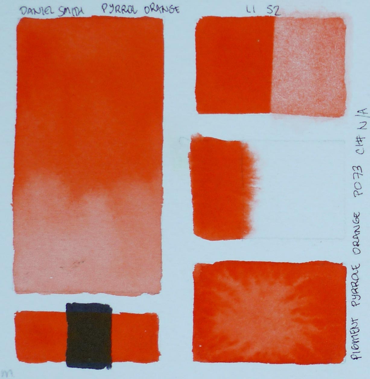
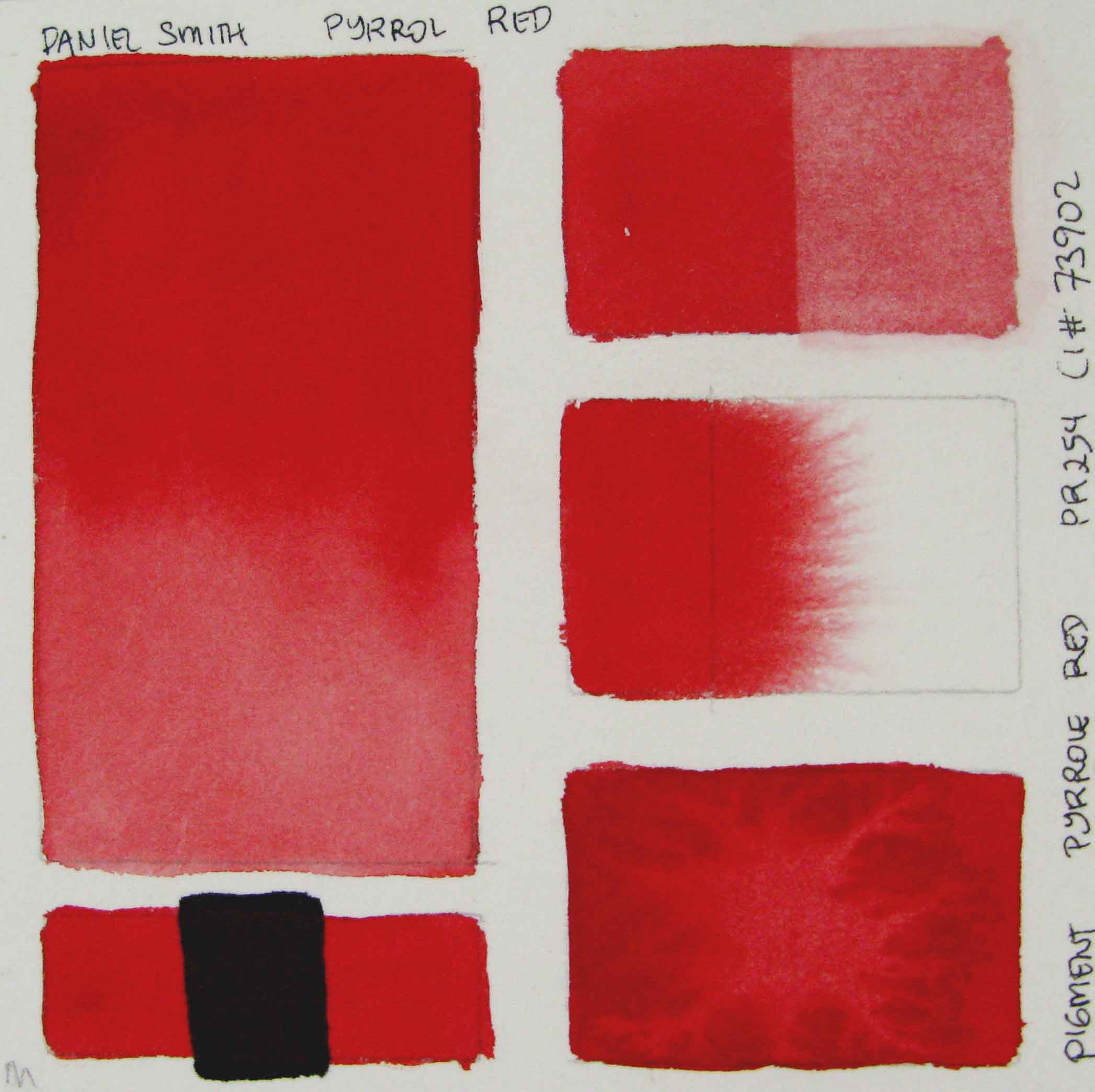
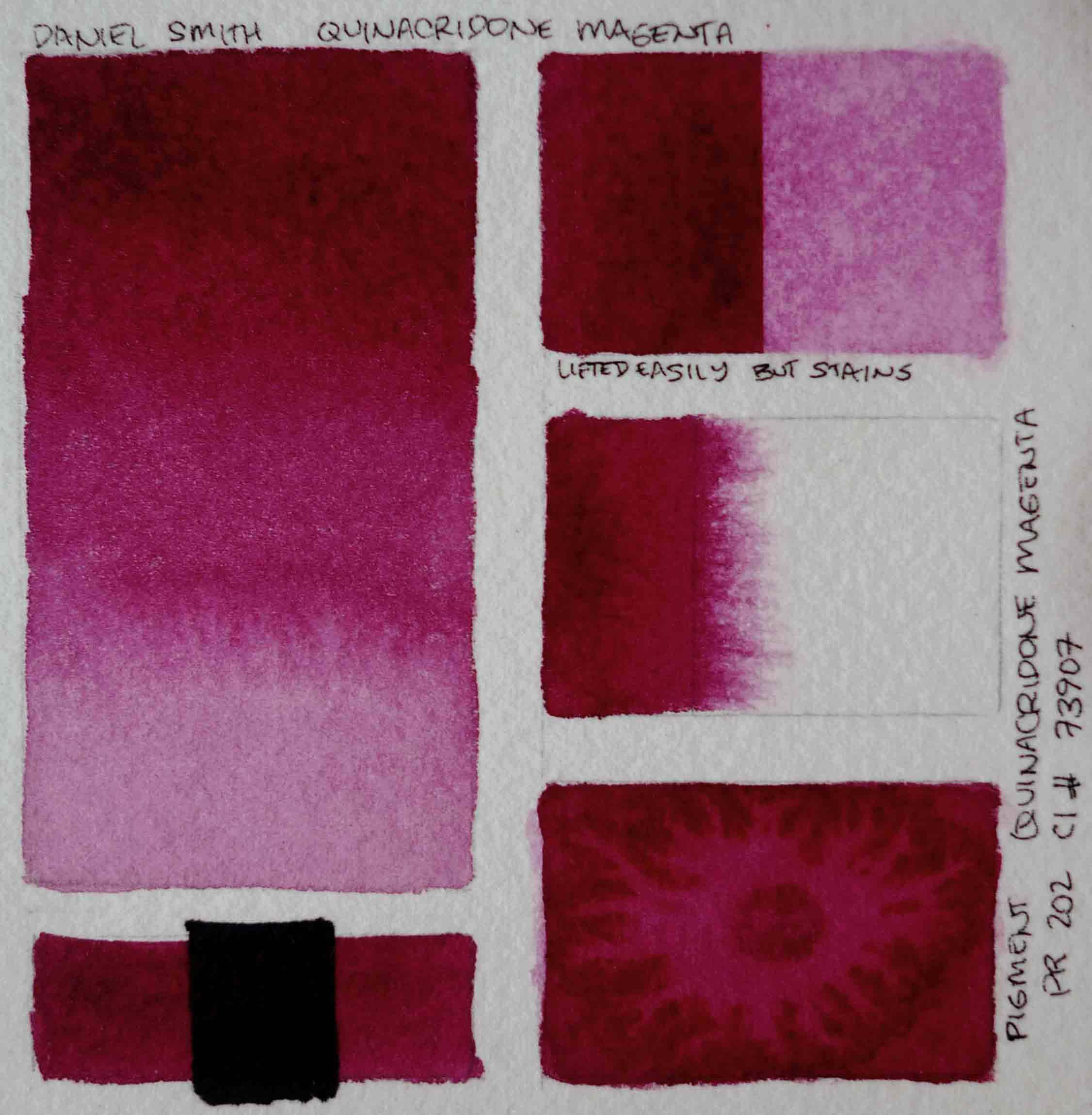
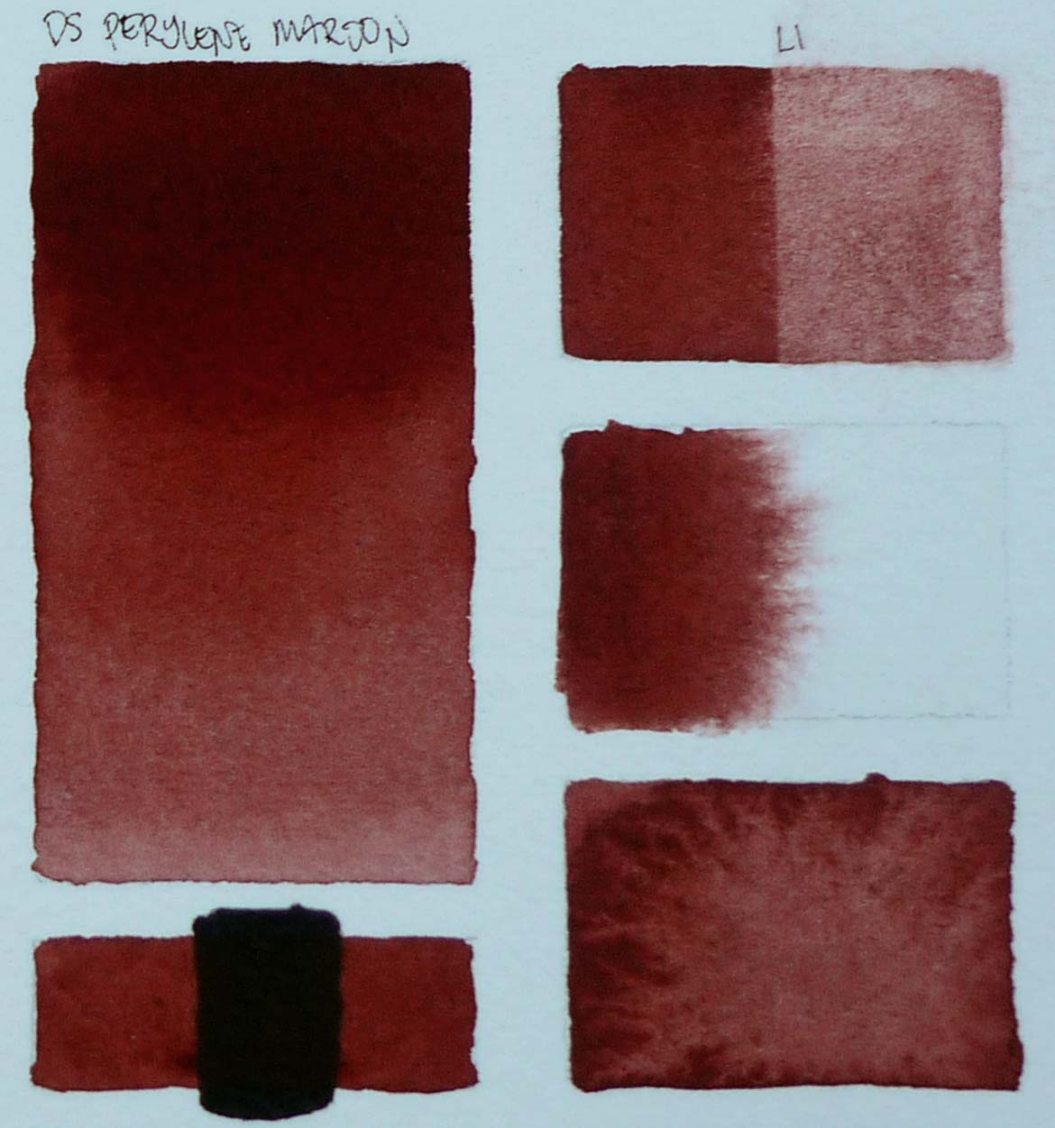
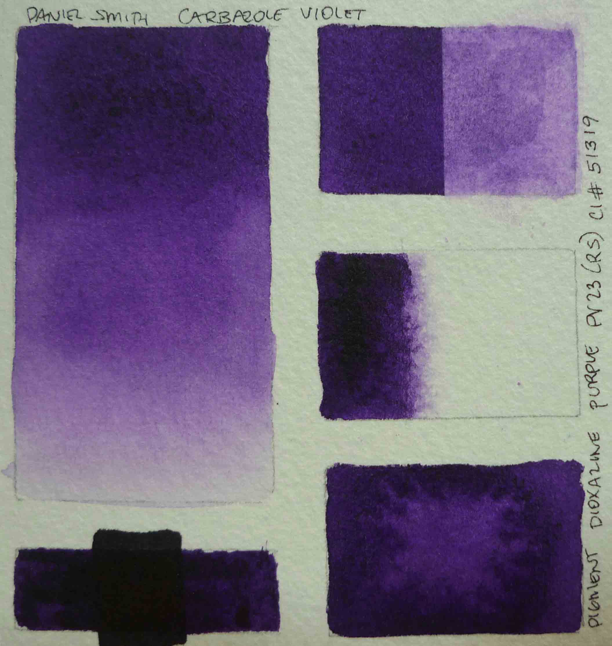
The Daniel Smith Company was the first to introduce the concept of dot cards.  This allowed artists to test or try out the paints at the store or at home to find the colors that best suit their rendering needs prior to buying.  Previously, the only way one can do color tests is to commit to buying whole tubes of paint or hope that friends have the color and would let us try them.  The accessibility allowed artists to explore and discover new colors without breaking the bank.  

It is a great honor for me to be among the artists included in the Daniel Smith Artists’ Palette feature.  Thank you very much John Cogley and Katherine Taylor.  I had the privilege of meeting them in Manila and was quite taken with the passion both share for developing the highest standards for watercolor production.

I also would like to take this opportunity to thank Dino and Ethel Pajao of DE’s Artroom for bringing this great line of product to the Philippines.

My Colors

It was very hard picking just 18 colors.  Over the years, I have so many “go to” colors from the DANIEL SMITH line that it took weeks before I could whittle my choice down to 18.  I considered a palette that would be great for painting flowers, still life and scenery.

Please allow me to share my swatches for the above colors.  These tests have been of great help to me in the past when I plan for paintings and buying.  I hope it can be of assistance to others who are researching the properties of these colors.

The pigment info are from the DANIEL SMITH reference.

I also included tips or observation about the paint.

Swatch Guide

  1.  Color gradation from mass tone to light wash.
  2.  Test for Transparency / Opacity.
    Except for the very dark colors (which of course would not show up against the black), any color that shows up against the black background would be classified as opaque or semi-opaque / semi-transparent.  If you can not see the color against the black, then it is transparent.
  3. Staining and lifting ability of the paint.
    Best to use the paper you plan to paint on as different papers may yield different staining results.  Heavily sized paper would make lifting easier while poorly or barely sized ones would absorb even the lifting colors well into the paper fibers.
  4. Bolting
    Test to see tendency of color to bolt or run when placed on damp paper.
  5. Backruns
    Tendency of the paint to bloom.  I use this also to see the effects that can be achieved by adding water to a layer of the color as it is about to dry.

DANIEL SMITH     Lemon Yellow
Lightfastness:       I
Staining:     2
Granulation:     No
Transparency:    Transparent
Pigments:     PY 175
Available in 15 and 5 ml tubes.

This is a cool yellow hard to create from other colors.  I like this because of its transparency.  Makes clean mixes.  When I need to render foliage and keep them on the cool side, I use lemon yellow to create greens from my blues.

DANIEL SMITH     Hansa Yellow Medium
Lightfastness:       I
Staining:     2
Granulation:     No
Transparency:     Transparent
Pigments:     PY 175
Available in 15 and 5 ml tubes.

This is a warm yellow. Does not look orangy.   Like Cadmium Yellow but transparent.

DANIEL SMITH     Nickel Azo Yellow
Lightfastness:       I
Staining:     2
Granulation:     No
Transparency:     Transparent
Pigments:     PY 150
Available in 15 and 5 ml tubes and as a watercolor stick

Mustardy yellow.   Great for mixing greens too.

DANIEL SMITH     Quinacridone Deep Gold
Lightfastness:       I
Staining:     2
Granulation:     No
Transparency:     Transparent
Pigments:     PO 48, PY 150
Available in 15 and 5 ml tubes.


That color between raw sienna and burnt sienna.  Transparent too.  Great for adding that earthy touch to orange blooms and for earth colors for scenery.

DANIEL SMITH     Pyrrol Orange
Lightfastness:       I
Staining:     2
Granulation:     No
Transparency:     Semi-Transparent
Pigments:     P0 73
Available in 15 and 5 ml tubes and as a watercolor stick.

My base orange color.   Sometimes, you just have to have the pure bright color so that the mixes also stay brilliant.  The Pyrrols and Quinacridones I was told by John Cogley were originally used in the auto and textile manufacturing industries.  These synthetic pigments, now adapted to watercolors, made it possible to have the bright and lightfast colors we now enjoy today.

Mix a bit of this with Quinacridone Magenta to create a delicate pink.  

DANIEL SMITH     Pyrrol Red
Lightfastness:       I
Staining:     3
Granulation:     No
Transparency:     Semi-transparent
Pigments:     PR 254
Available in 15 and 5 ml tubes and as a watercolor stick.

Brilliant pure red.

DANIEL SMITH     Quinacridone Red
Lightfastness:       I
Staining:     3
Granulation:     No
Transparency:     Transparent
Pigments:     PV 19
Available in 15 and 5 ml tubes and as a watercolor stick.


DANIEL SMITH     Quinacridone Magenta
Lightfastness:       I
Staining:     3
Granulation:     No
Transparency:     Transparent
Pigments:     PR 202
Available in 15 and 5 ml tubes.


This is a beautiful color used as is.  It is also one of my go to color for creating that smooth transition between fuschia, red and violet.  Mixed with orange, it can produce a rosy pink.

DANIEL SMITH     Perylene Maroon
Lightfastness:       I
Staining:     4
Granulation:     No
Transparency:     Semi-transparent
Pigments:     PR 179
Available in 15 ml tubes.

Good earth color as well as for darkening reds.


DANIEL SMITH  
  Rose of Ultramarine
Lightfastness:       I
Staining:     3
Granulation:     Yes
Transparency:     Transparent
Pigments:     PB 29, PV19
Available in 15 and 5 ml tubes.

Does it not make you want to buy a flower of the same color just so you can use it?

DANIEL SMITH     Carbazole Violet
Lightfastness:       I
Staining:     3
Granulation:     No
Transparency:     Semi-transparent
Pigments:     PV 23 (RS)
Available in 15 and 5 ml tubes and as a watercolor stick.

A true violet.  I use this for enhancing cobalt blue and French Ultramarine passages.  Also a good color for toning down my tube greens.  Great also for darkening reds.

DANIEL SMITH     Ultramarine Blue
Lightfastness:       I
Staining:     3
Granulation:     Yes
Transparency:     Transparent
Pigments:     PB 29
Available in 15 and 5 ml tubes and as a watercolor stick.

The granulation of Ultramarine Blue is more pronounced than the French Ultramarine color.  More bluish also.  Both have granulation but this one is just more pronounced.

DANIEL SMITH     Cobalt Blue
Lightfastness:       I
Staining:     2
Granulation:     Yes
Transparency:     Semi-transparent
Pigments:     PB 28
Available in 15 and 5 ml tubes and as a watercolor stick.

Cobalt Blue, Quinacridone Magenta, and Lemon Yellow would make a good primary colors set.  

DANIEL SMITH     Cobalt Teal Blue
Lightfastness:       I
Staining:     1
Granulation:     Yes
Transparency:     Semi-transparent
Pigments:     PG 50
Available in 15 and 5 ml tubes and as a watercolor stick.

A very versatile color.  I almost always use it on my floral paintings specially for white and yellow blooms.   This is a good color also for painting water and glass.

DANIEL SMITH     Sap Green
Lightfastness:       I
Staining:     3
Granulation:     Yes
Transparency:     Transparent
Pigments:     PO 48, PG 7, PY 150
Available in 15 and 5 ml tubes and as a watercolor stick.

Yes, I do use tube greens.  This is one of my favorites.  I tweak this with different colors.  Check out one of my painting progression posts to see what colors I use to make the tube greens look more natural.

Sun Kissed Hibiscus >

DANIEL SMITH     Viridian
Lightfastness:       I
Staining:     1
Granulation:     Yes
Transparency:     Transparent
Pigments:     PG 18
Available in 15 and 5 ml tubes.

Look at how it granulates.  This is one of the best mixing greens.  A subtle green that adds that interesting suggestion of texture to any wash.  It gets hard fast on pans or pours compared to the other tube colors but is easily reconstituted.

DANIEL SMITH     Neutral Tint
Lightfastness:       I
Staining:     2
Granulation:     No
Transparency:     Semi-transparent
Pigments:     PBk 6, PV 19, PB15
Available in 15 and 5 ml tubes.

As the name suggests, it is a neutral tinting black.  For when you want to tint or gray your colors without affecting the colors’ temperature.

DANIEL SMITH     Buff Titanium
Lightfastness:       I
Staining:     1
Granulation:     Yes
Transparency:     Semi-transparent
Pigments:     PW 6:1
Available in 15 and 5 ml tubes and as a watercolor stick.

When I first saw and tried this color from a dot card, I had to have it.  As many know I am a Game of Thrones fan and this color made me think of the stones used to build Dubrovnik (King’s Landing).  This color is great for rendering marble, stone, and other garden features. Also is useful in botanical and wildlife illustration.  

Other colors that I would recommend:

Anthraquinoid Red
Ultramarine Turquoise
Wisteria
Lavender
Permanent Rose Madder
Gray Titanium
Undersea Green
Manganese Blue Hue

https://danielsmith.com/tutorials/painting-a-realistic-monitor-lizard/

For those interested to order DANIEL SMITH Products:

Look for them from local retailers or visit the online shop  www.desartroom.com