Not meant as a paint along tutorial but to share only how I created this painting.
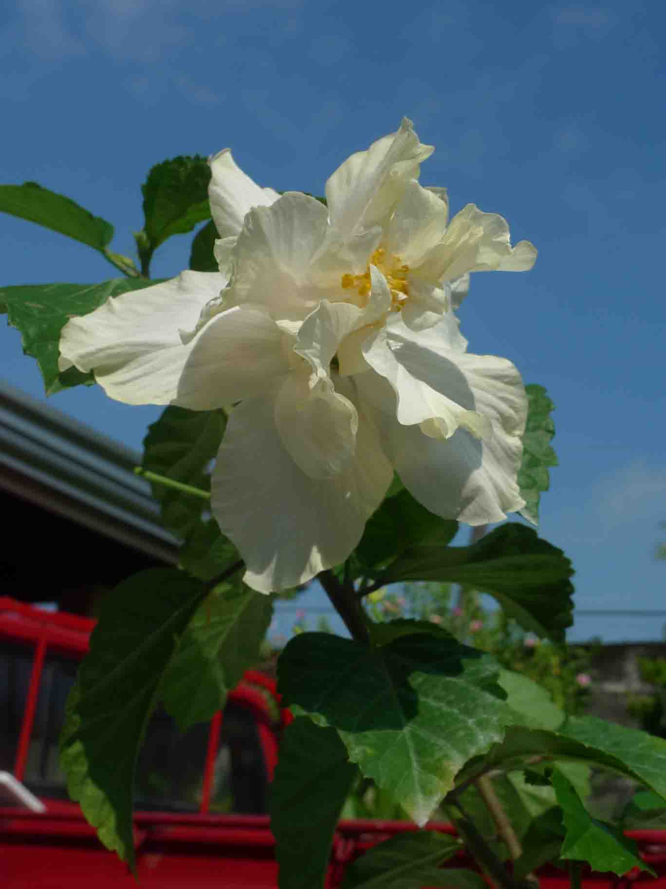
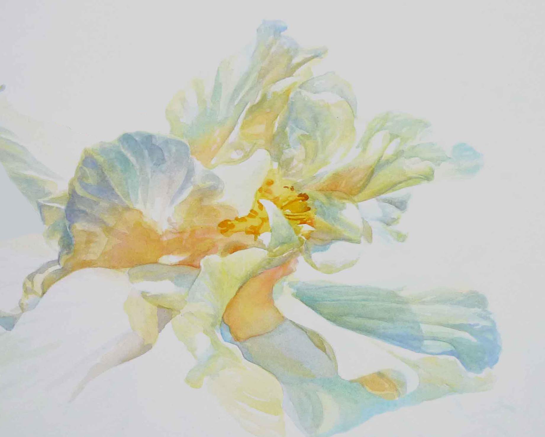
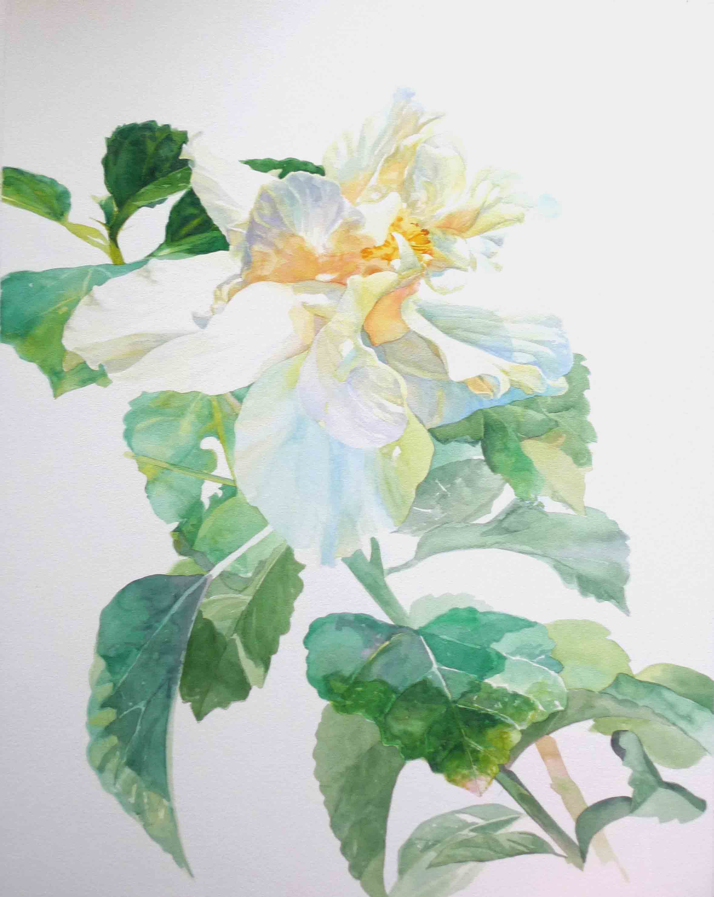
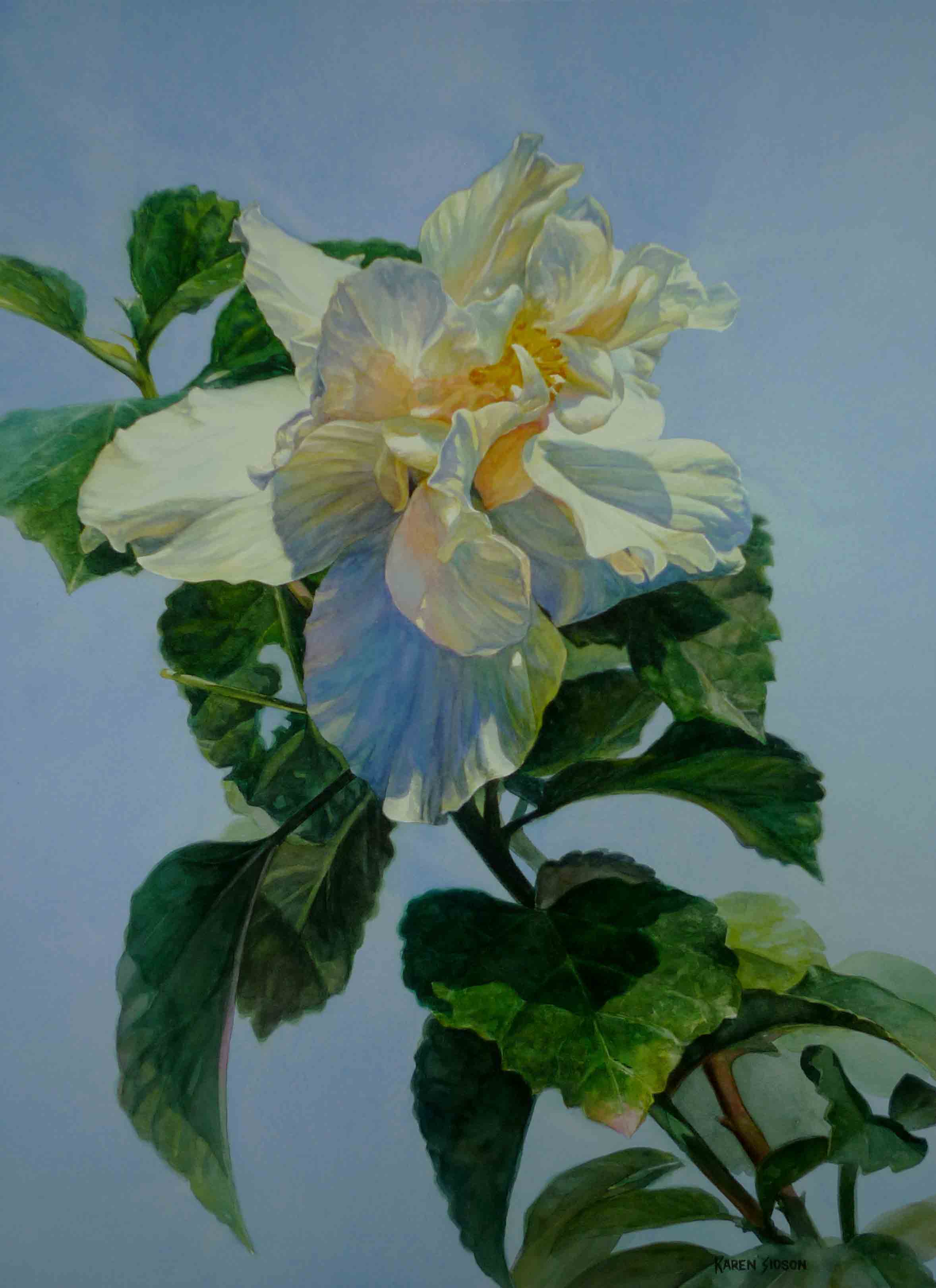
White flowers are beautiful to paint. If you observe white objects closely, you will see a rainbow of colors reflected on them. The reference for this painting is a hibiscus plant in our garden.
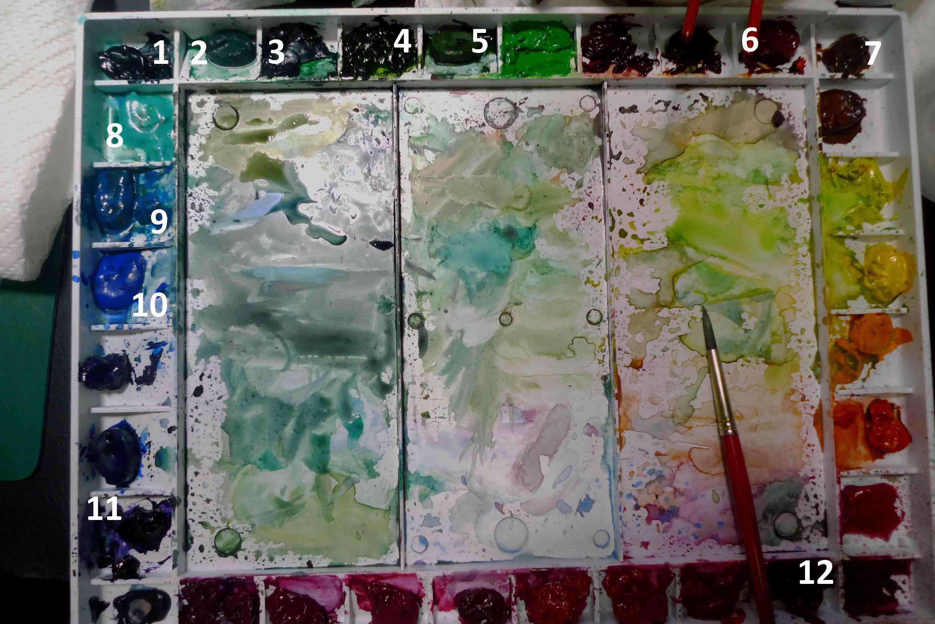
Colors used: All DANIEL SMITH Artist Grade Watercolors
lemon yellow new gamboge rhodonite genuine anthraquinoid red cerulean blue cobalt teal cobalt blue phthalo green sap green neutral tint
(plus small amounts of some colors to slightly alter the tube greens. Shown later.)
paper: Fabriano Artistico 140 lb cold press watercolor paper
.
Using the White of the Paper There are several ways to lighten a color. One is the addition of the color white to the base color. Another is the technique used in transparent watercolor painting: take advantage of the transparency of the medium and use the whiteness of the paper – more specifically the reflected light bouncing from the white of the paper – to create lighter versions of a color. Pigments block this bouncing light. When watercolors are diluted in water, the more water used to dilute the mix, the more light gets to pass through to be reflected back from the paper. The resulting visual mix produces lighter colors.
Leave Outs For areas that need to appear white, the natural color of the paper can be used. Artists will avoid putting paint on the area to keep it light (also called a leave out.) These parts will not look white in the beginning as most papers come in off white or very light cream color but as you add more hues and start shading surrounding areas, it will strengthen the illusion that the untouched areas are white.
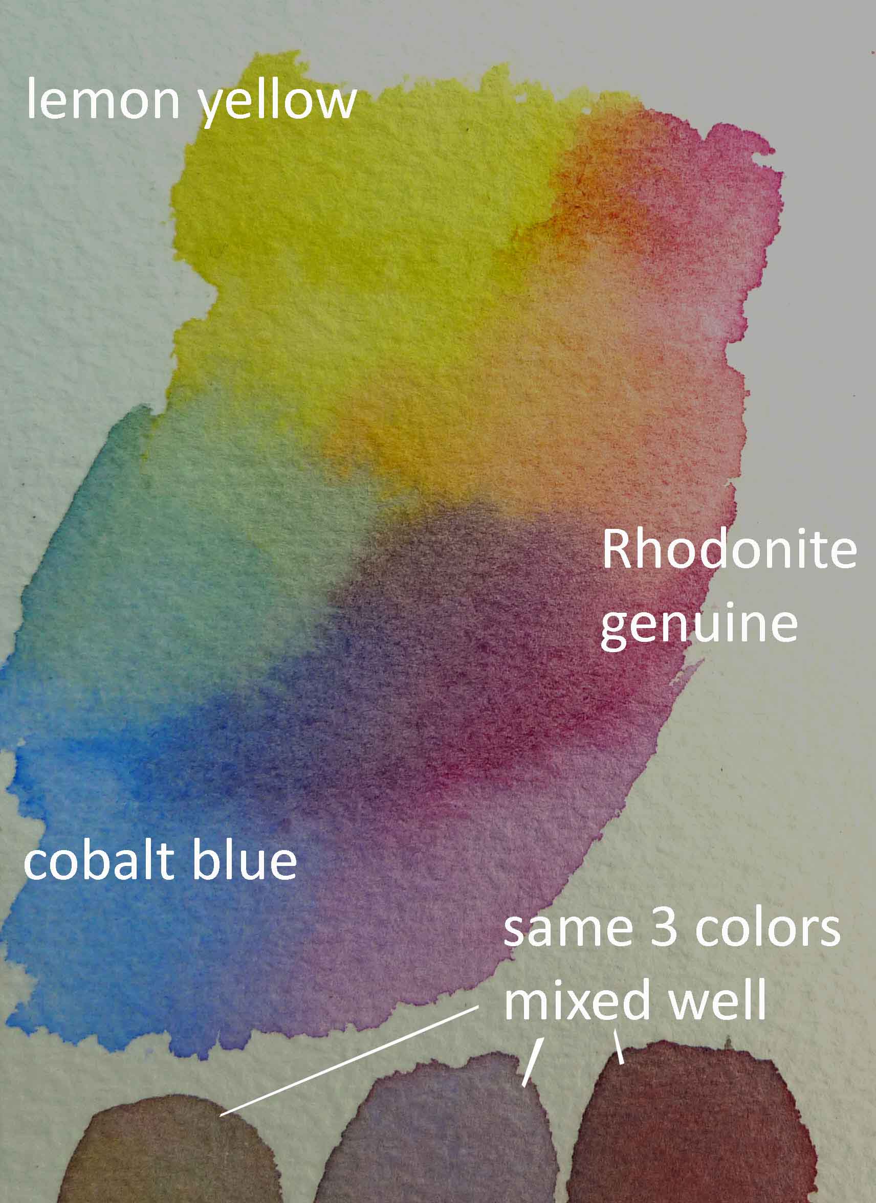
I used the following colors for the bloom:
lemon yellow new gamboge Rhodonite genuine cerulean blue cobalt teal cobalt blue
This is a first time for me to use Rhodonite genuine in a painting. From the DS Primatek line, this pink has granulation and mixes well with lemon yellow and cobalt blue. It produced quite a beautiful range of colors actually when mixed with the other primaries. Made beautiful purple, green, orange and even the grays looked good. The three samples at the bottom were a mix of the three colors in varying ratio. Good neutrals. I used the brown created here for the dark stamens.
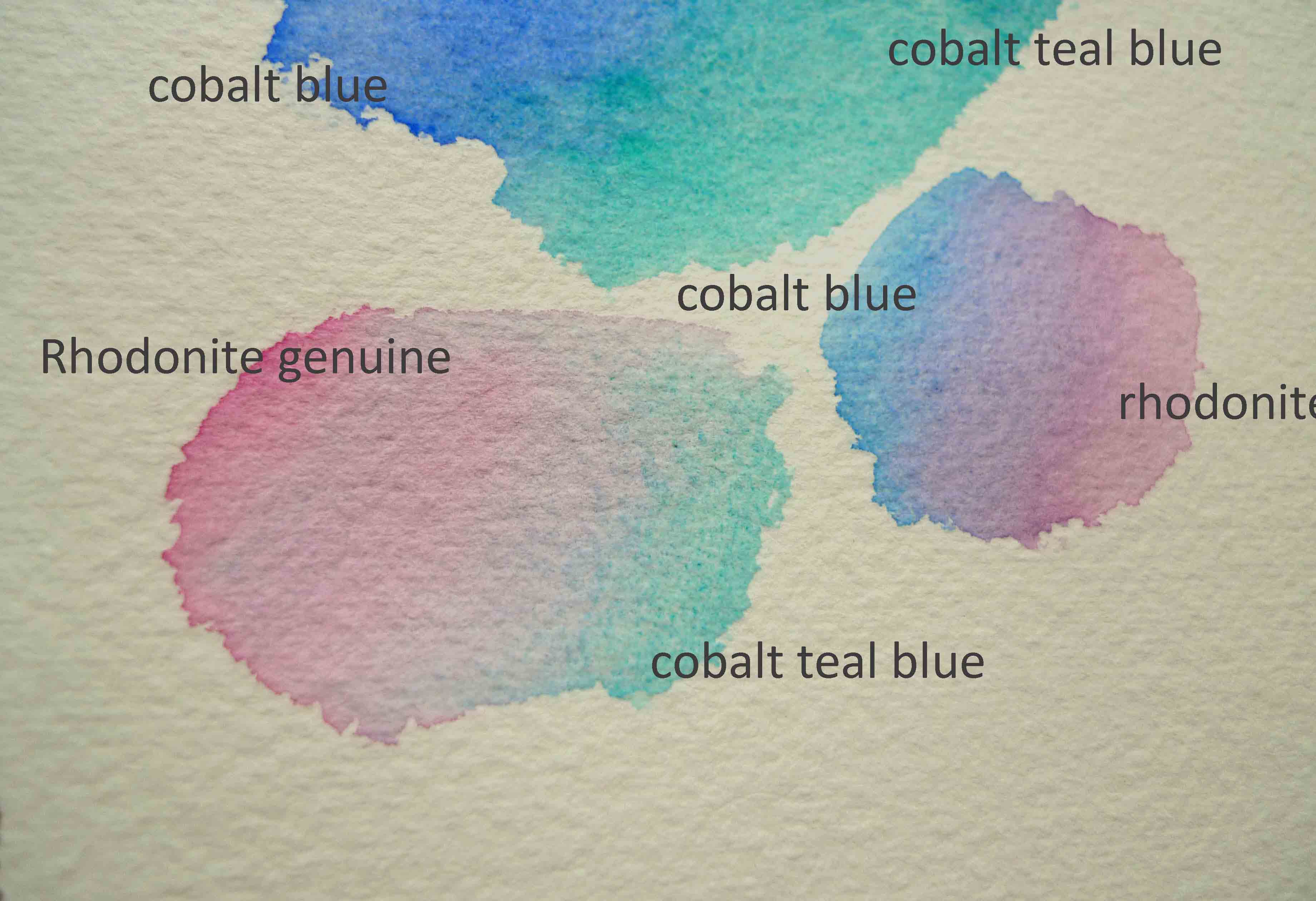
I used three colors for the parts that reflect sky color: Cobalt blue, cerulean blue and cobalt teal blue. Mix shown here although I seem to have forgotten to label the middle part (got cut where pure cerulean blue was. Shows where I pulled it into the cobalt blue and cobalt teal blue mix though).
I do my color mixing on the paper and with minimal agitation if I can help it. By not mixing thoroughly, some of the original colors used in the mix show through and this contributes to the vibrancy of the final colors.
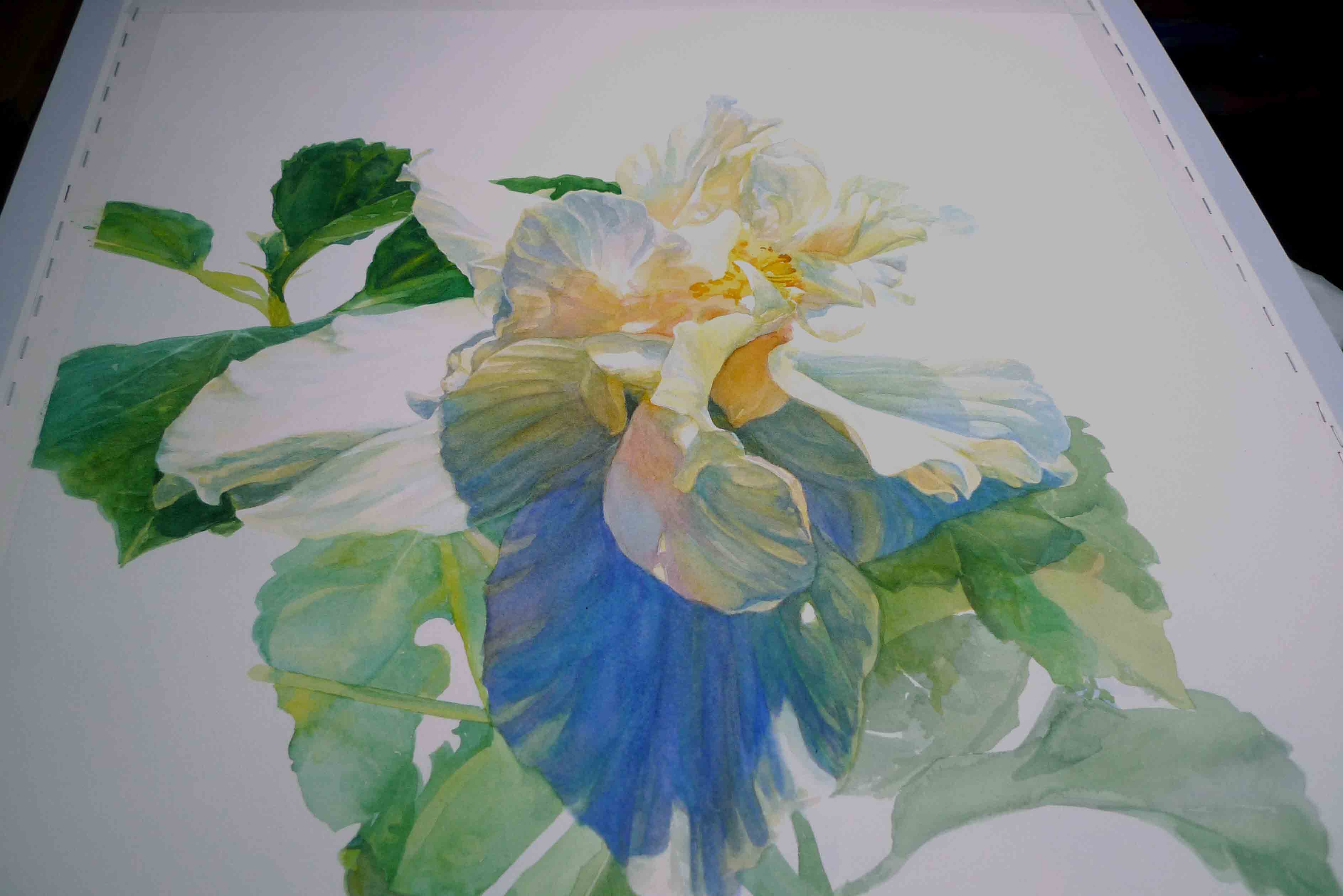
Above mixes applied to the flower.
I could not resist finishing the leaves on top left corner area. I wanted to see the petals pop out.
Painting Greens
I do use tube greens. Straight from the tube, they may look too strong… unnatural. With a bit of tweaking though, by mixing them with other colors on your palette, you can produce more natural looking greens. Tube greens are very convenient and can be great additions to your palette.
My base greens are sap green and phthalo green but I alter it by adding colors from my flower palette. You can see this in my first layer for the leaves.
Some favorite colors for mixing with phthalo and sap green are Anthraquinoid red and Carbazole violet. Anthraquinoid red and phthalo green make a vibrant black. Carbazole violet and greens make beautiful dark browns.
Neutral black is a good black also. It can be used to darken the greens without altering the temperature.
Applying the various greens on the leaves.
Favorite tube greens and colors for tweaking the greens.
Ultramarine turquoise
Viridian
Phthalo green
Sap green
Cascade green
Quinacridone burnt sienna
Hot Mulled Cider Wine
Cobalt teal blue
Cerulean blue
Cobalt blue
Carbazole violet
Anthraquinoid red
Actually, I use almost all colors here on my palette for altering greens.
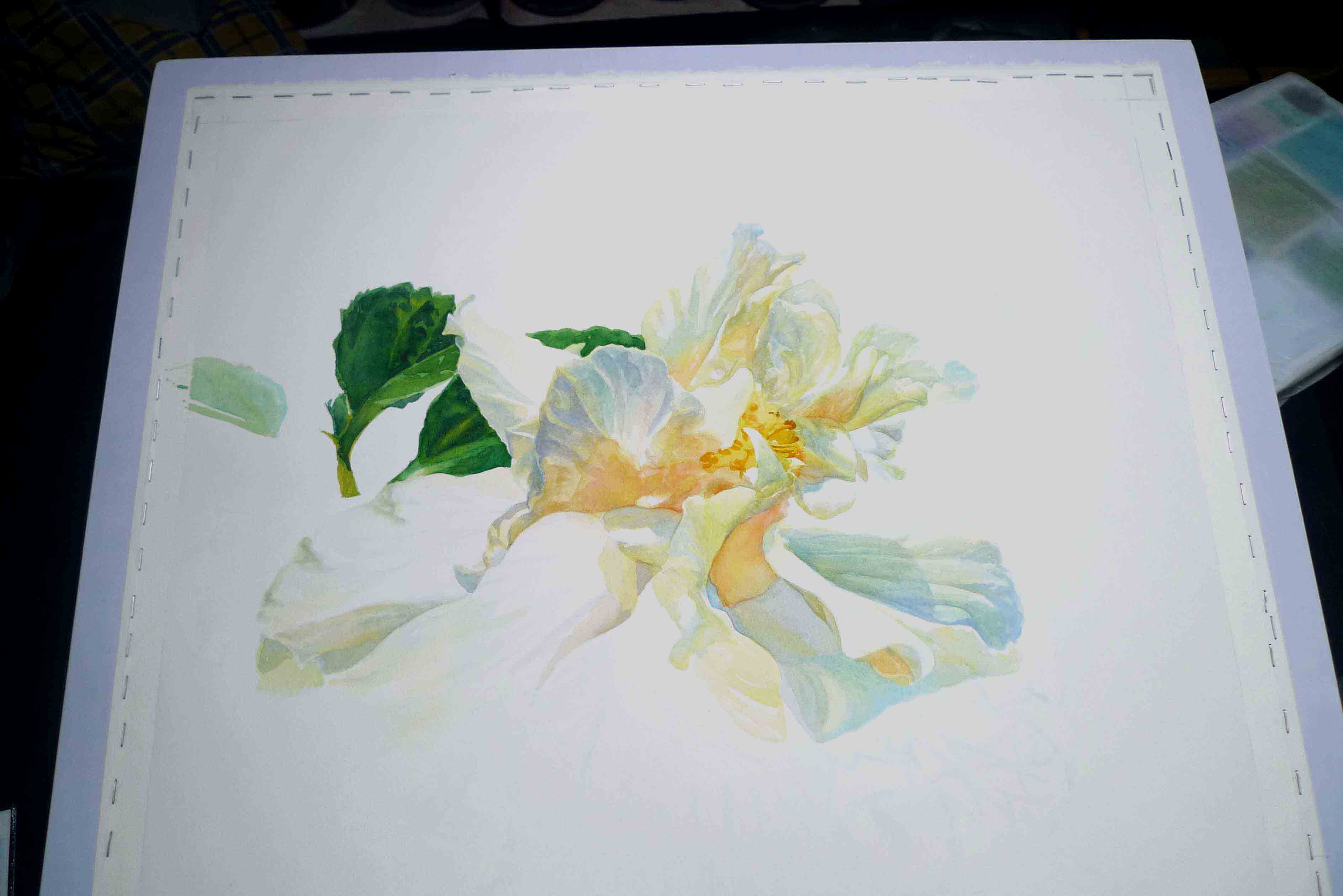
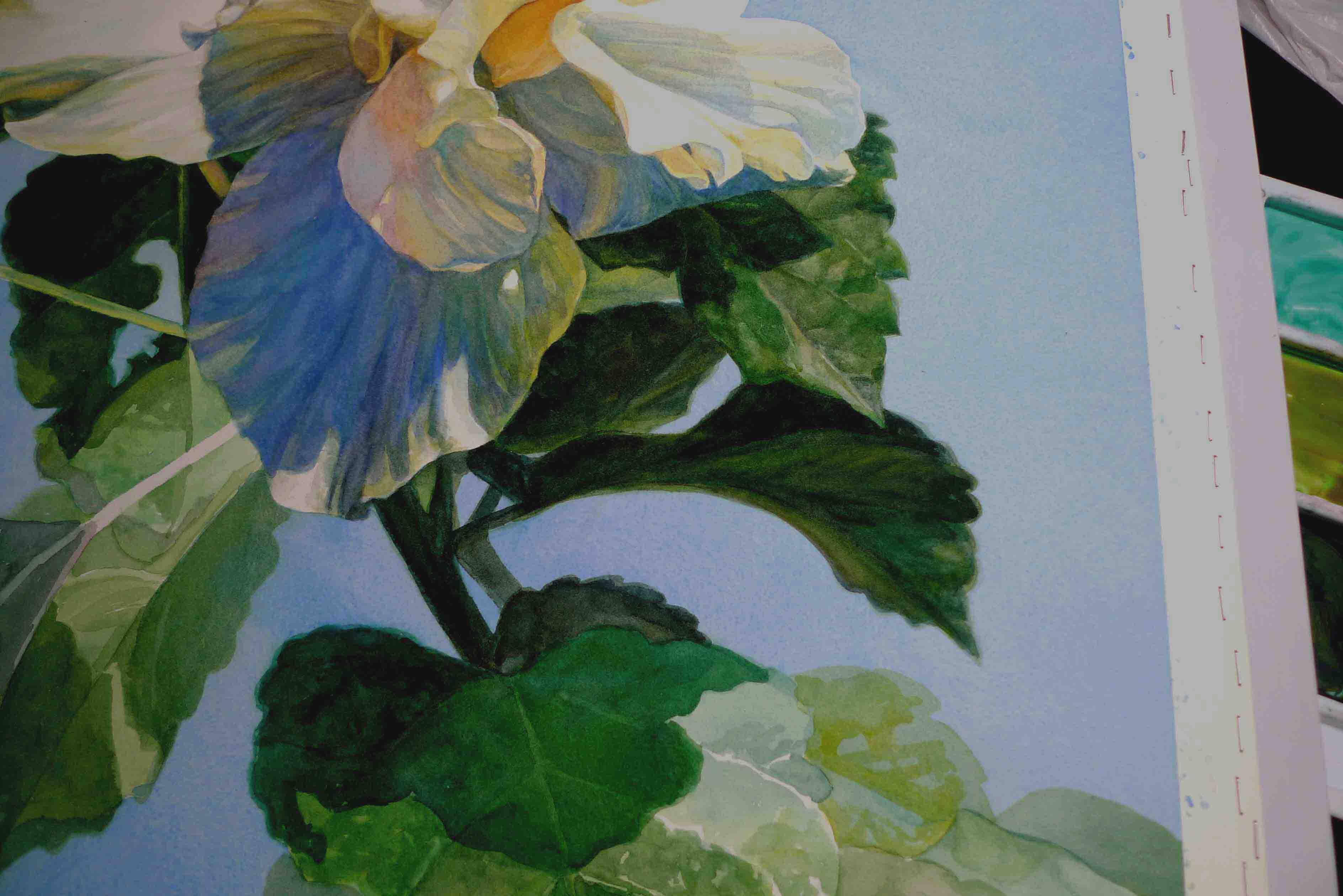
While the leaves are drying, I worked on the bloom again. The second layer for the bloom looks too dark but that is because color is relative. Against the light background, it will look dark.
Once I put in the background color (cobalt blue and cerulean blue), that seemingly dark bottom petal will look just right. The background would also define and complete the illusion that the petals are white.