A tutorial on painting white blooms in watercolor using the color of the paper.
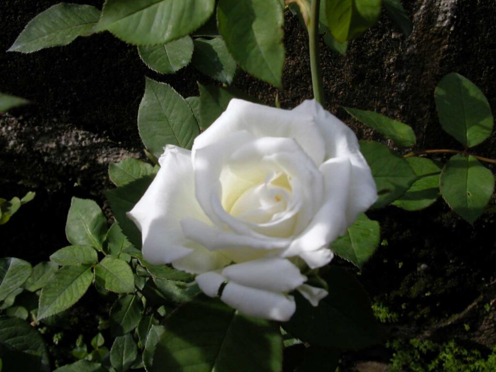
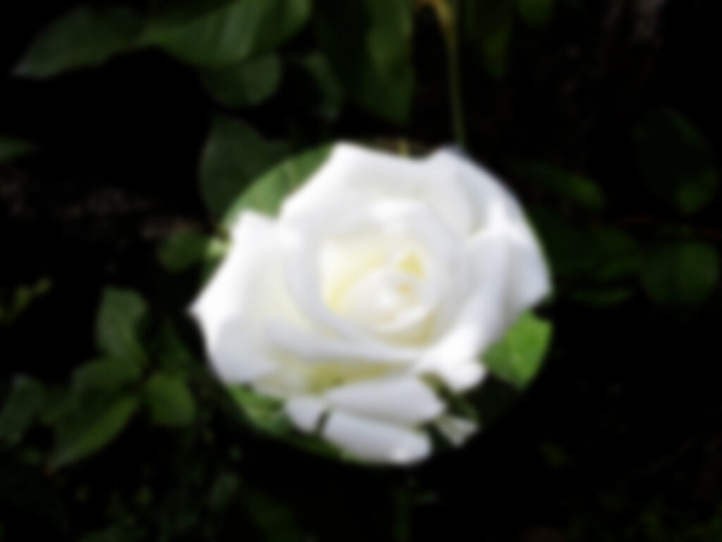
The reference photo
This white rose is from our garden. The rose bush was planted next to the trunk of a tree so the bloom was in shadow until a chance shaft of light turned some of the petals luminous. I clicked the camera at that point and got this high contrast reference photo.
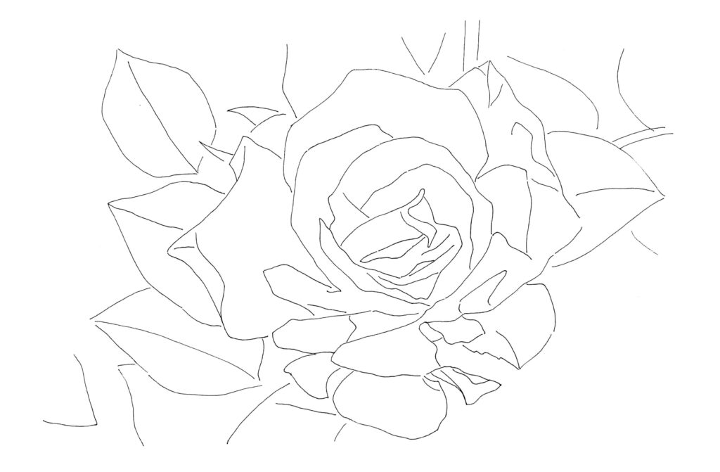
Drawing guide
Using the reference photo as a guide, I picked elements for a diagonal composition.
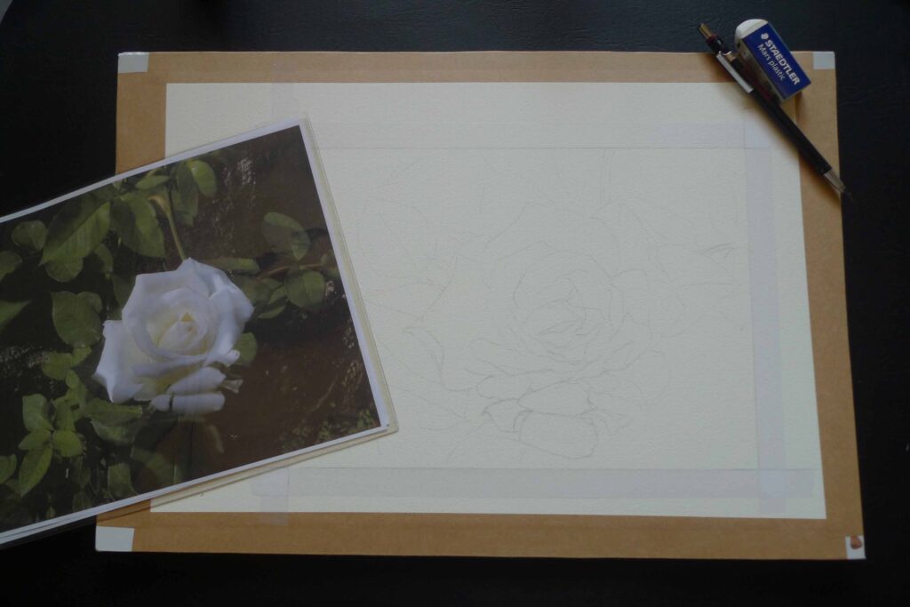
Drawing to paper
With very light pencil pressure, I drew the main subject – the rose – slightly off center and lower. Stems and leaves were placed to anchor the flower in place and to serve as additional interest.
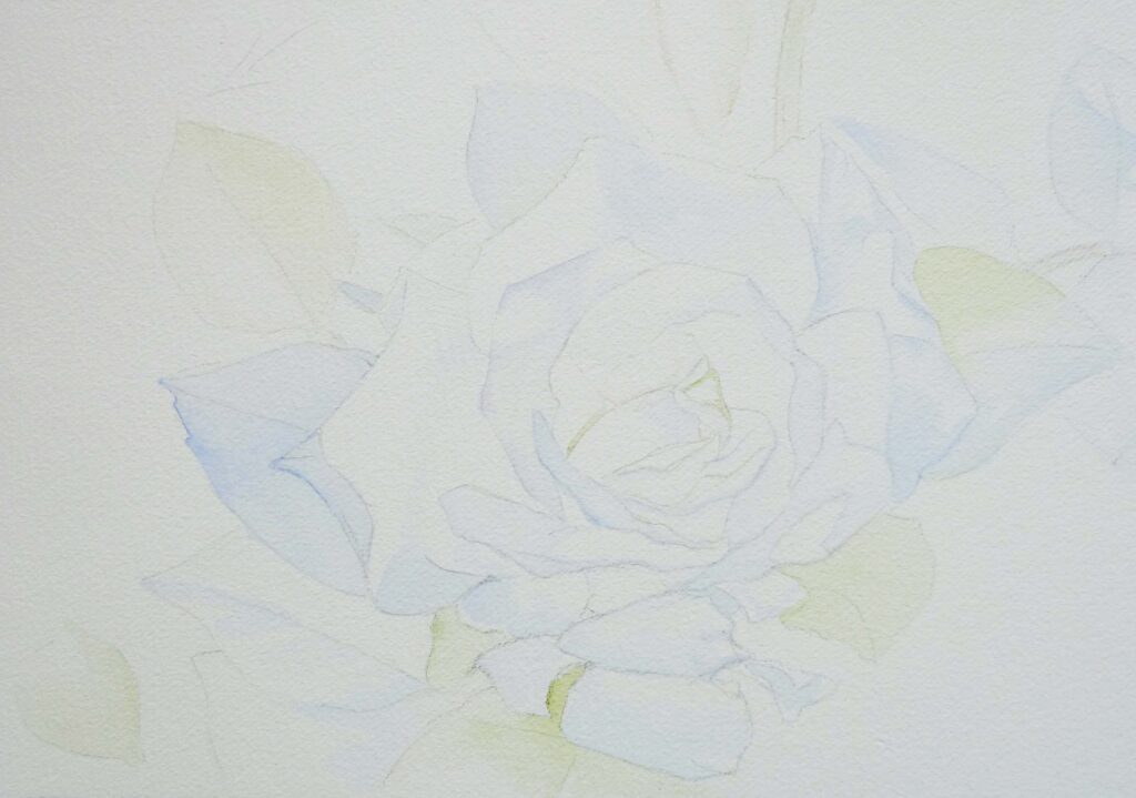
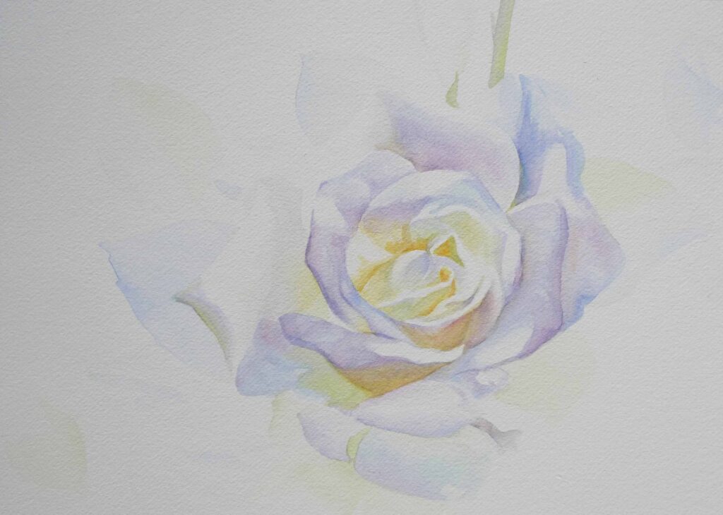
Preserving my guides
I laid down very light washes of the local colors to help define the shapes. These will serve as my new guide when I erase the pencil marks. While pencil lines can add a certain beauty to watercolor paintings, I will be removing them here to get the softer look I want for this painting.
The natural color of the paper will be used to portray “white.” Leave-out is the term for not painting on areas designated to be colored white. Preserve these areas by painting around them.
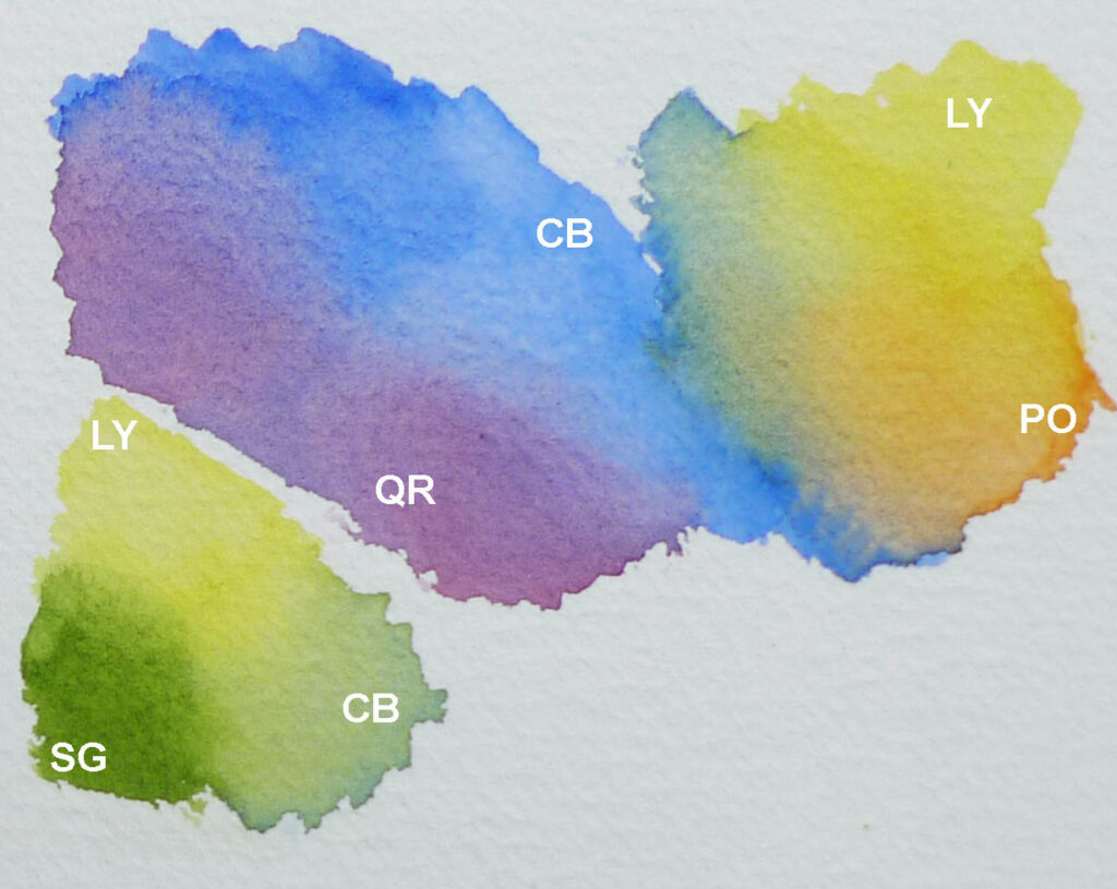
Flower palette
The following colors were used on the blooms:
LY – Lemon Yellow PO – Pyrrol Orange CB – Cobalt Blue QR – Quinacridone Rose SG – Sap Green
All artist grade watercolors from DANIEL SMITH.
How to define the petals softly
Instead of outlines, one can employ the following techniques:
Color temperature shifts – define a border by using warm next to cool colors.
Counterchange – when you place a dark passage against a light area and a light area against dark.
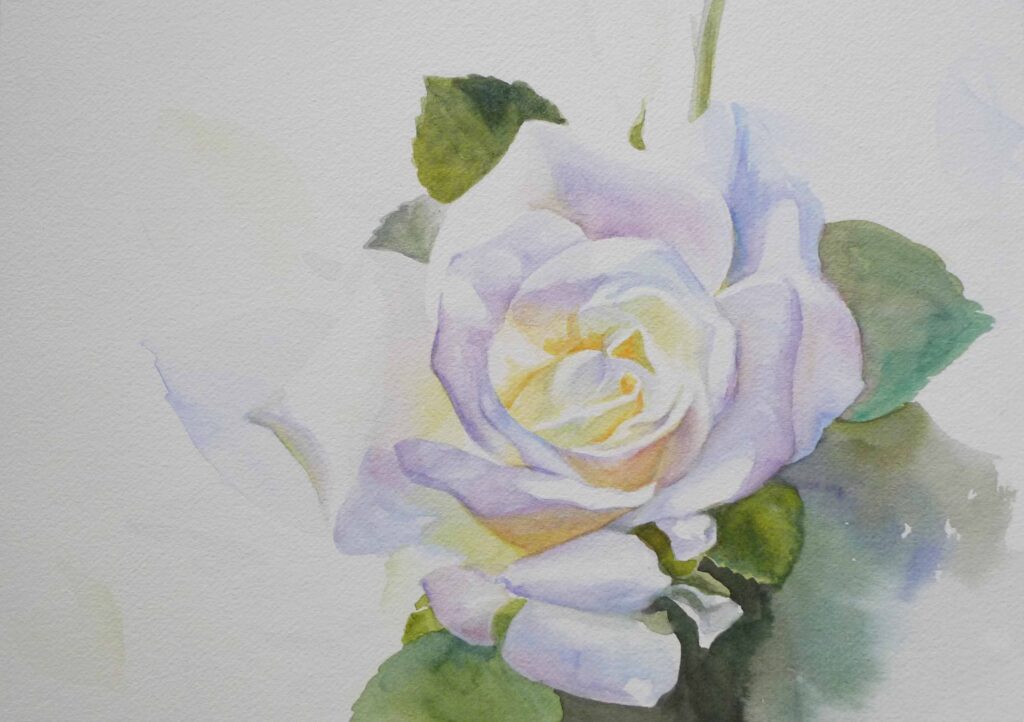
Foliage and background palette
I used the following colors for the leaves and background.
PG – Phthalo green (ys) NT – Neutral Tint AR – Anthraquinoid red CTB – Cobalt Teal blue UT – Ultramarine turquoise SG – Sap Green
See the beautiful mixes one can create from them.
Color relativity
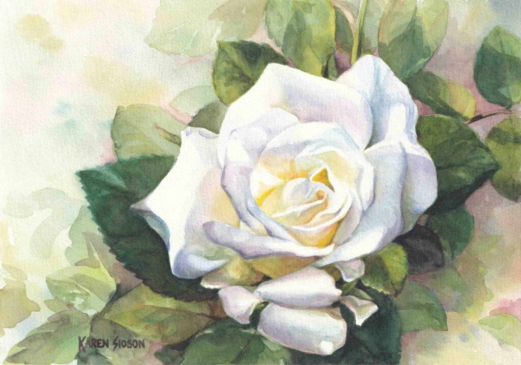
A color can be light or dark, warm or cool, depending on the colors next to it. See how the addition of the darker colors of the foliage and background made the whiteness of the rose pop out. The “white” is still the color of the paper but the contrast provided by the leaves make it seem a lot lighter. Likewise, the yellow and orange glow in the flower center feels warm juxtaposed against the cool colors of violet and blue used in the adjacent petals.
Planning the final look for the painting
Squint your eyes and analyze the reference photo. This blurs the colors and details and simplifies the values and shapes in a scene or picture. Here, the rose is a big white circle in the middle of a dark ground. Not exciting and somehow static but can be remedied.
Encouraging the eyes to explore
I chose a light background for the white rose to minimize the isolation of the subject in the center. This would encourage also the exploration of the background as our attention is programmed to look for similarities in our surroundings. From the light colors of the main focal point – the flower, the attention is drawn to the light background. Similarities in shapes can also be seen throughout the painting from the shape of the leaves to the shape of the petals.
Contrast whether in value or color is also a technique one can use to direct the viewer’s eyes. High contrast in value between the white petals and adjacent dark leaves help direct attention back to the focal point.
Use these techniques to encourage exploration of all parts of the painting and to direct the viewer’s attention back to the focal point.