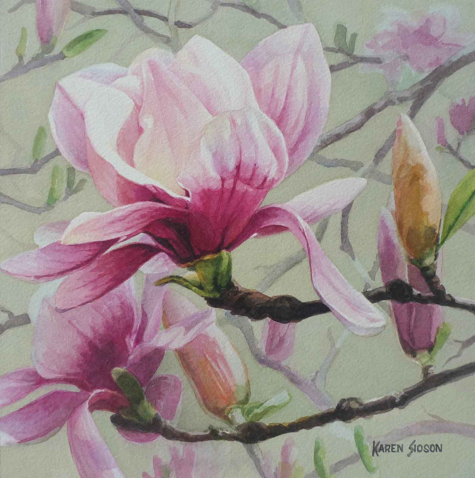
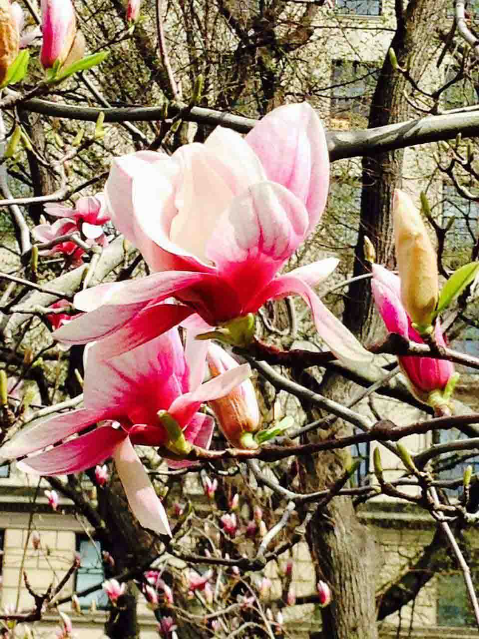
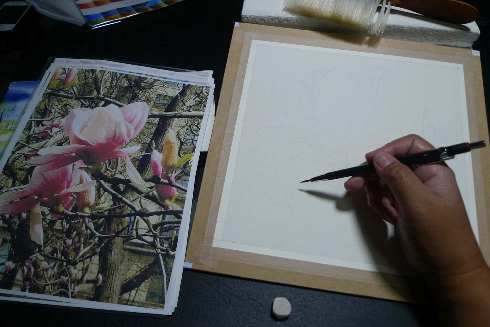
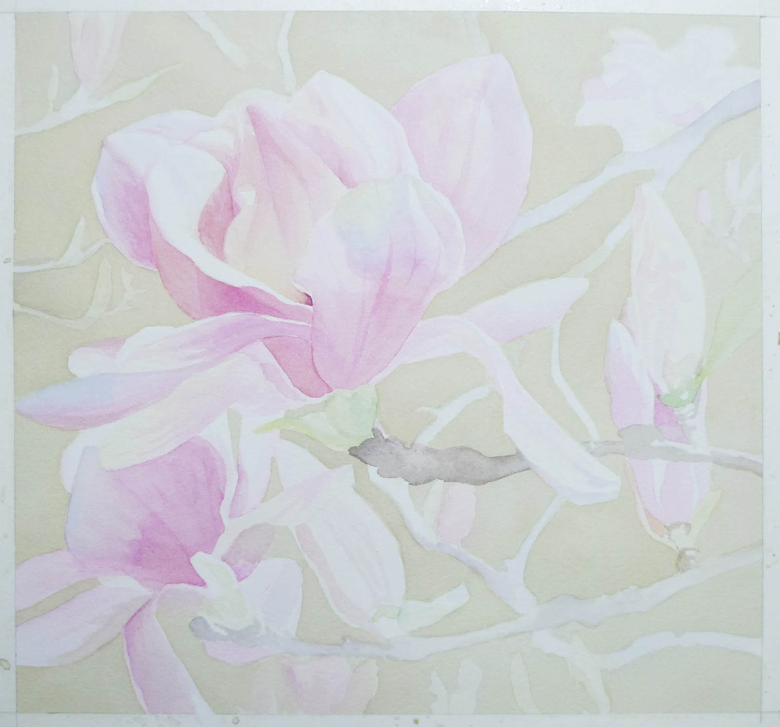
I invest the most time in the study and planning stage. While I do use photo references when I work with flowers, this is supplemented by detailed studies and notes I make from life. These Magnolias posed a challenge as I have never seen a Magnolia plant or bloom except in pictures.
Photos may catch the details and colors accurately but it still renders the subjects in 2D – a flat plane. Drawing allows me to analyze and make sense of all that I see finding logic in how the structures are put together. I check the connections and orientation of the parts. I try to figure how the color in one part can affect colors in the adjacent planes. I also look for patterns and structures that define the bloom.
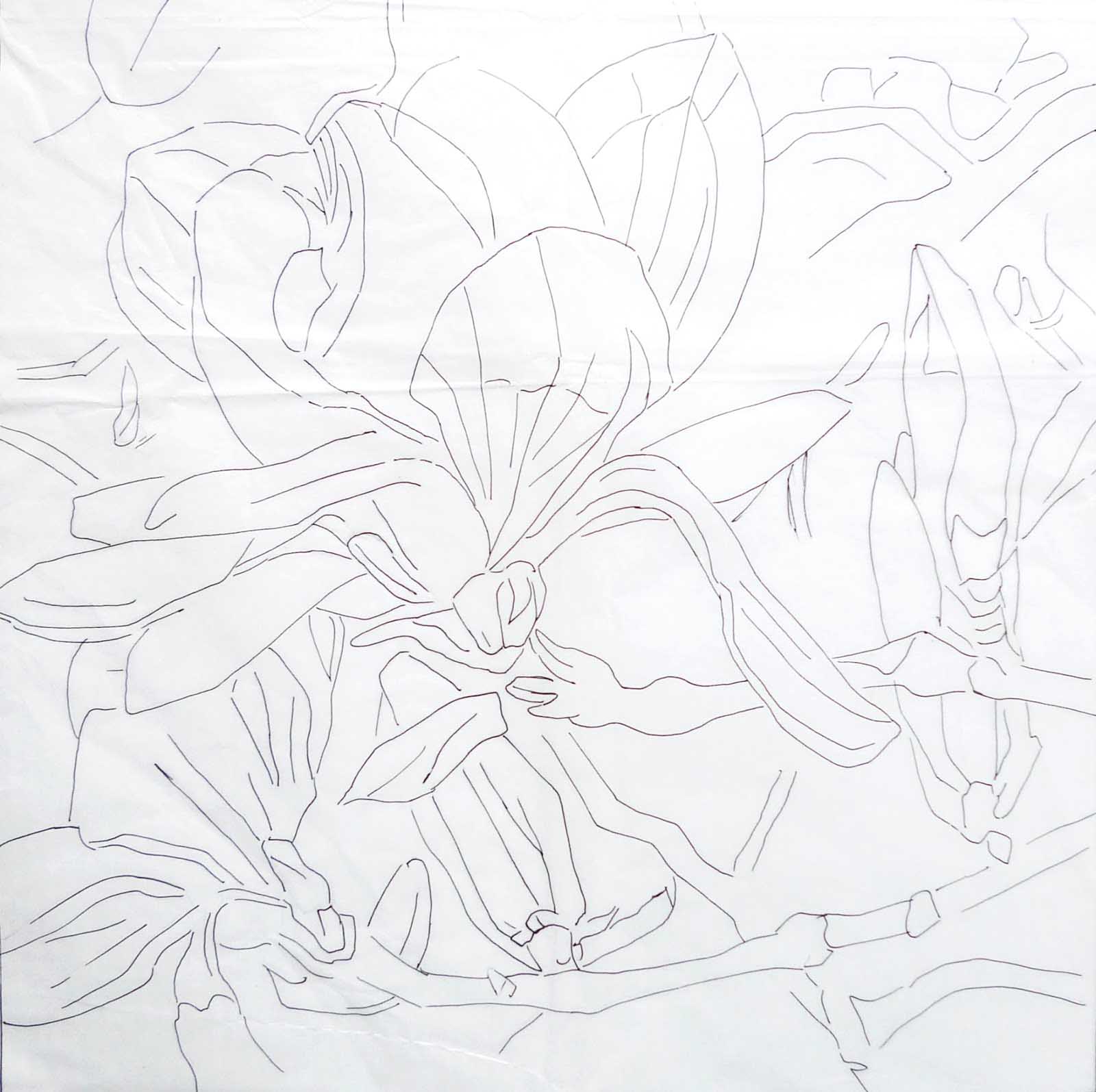
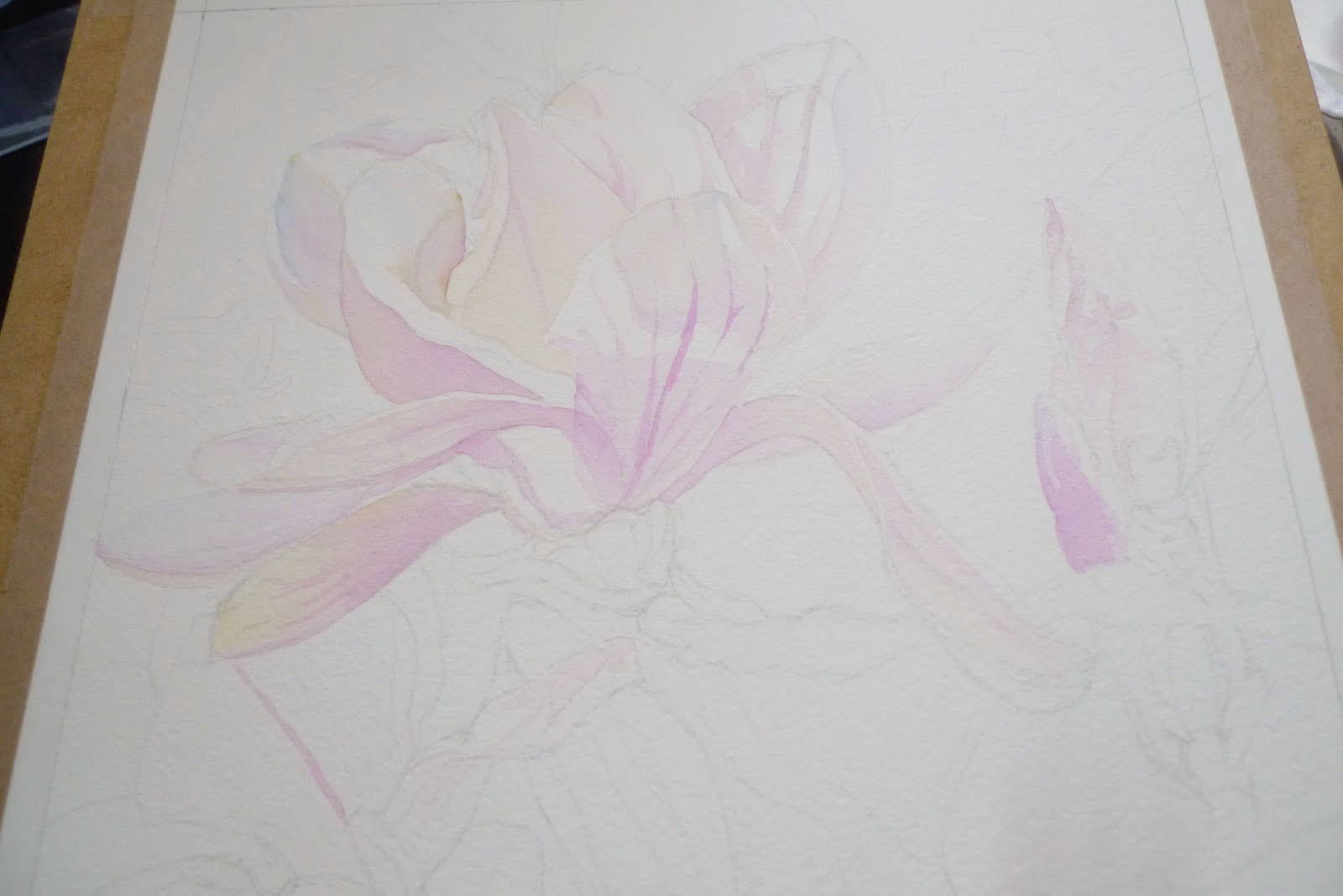
I drew direct on the paper using very light pencil lines. Hard to see on the watercolor paper closeup photo so I traced it instead and inked the trace here. Those wanting to practice may download and use this pattern.
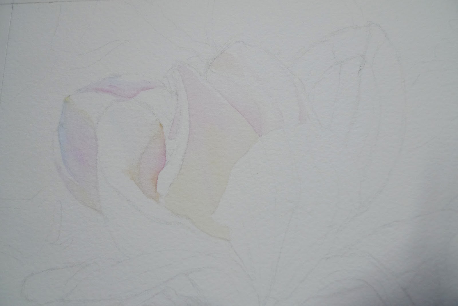
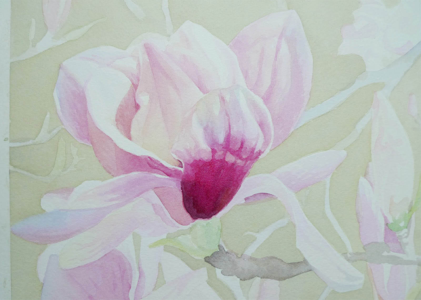
For my first layer, I placed only very light washes. Just enough to help me establish shapes and create my color map or guide for the next layers.
Color mixing tips next.
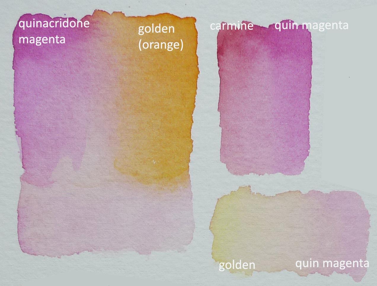
I included swatches in this tutorial so you can do a version of this exercise with whatever paint brand is available to you.
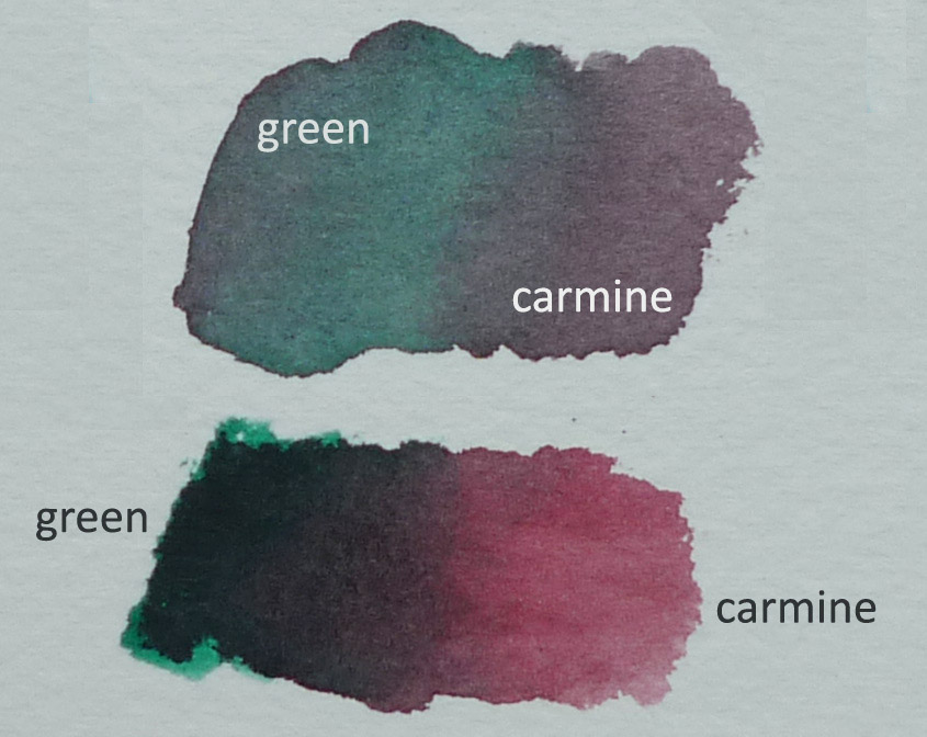
See how Quinacridone Magenta plus orange can make a delicate pink. I also checked what the addition of a red (Carmine) can do to the quin magenta
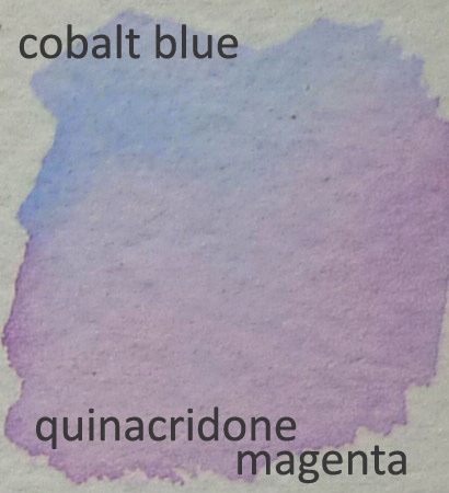
A blue tinged pink can be created by mixing cobalt blue and quinacridone magenta. Look at that lovely lavender.
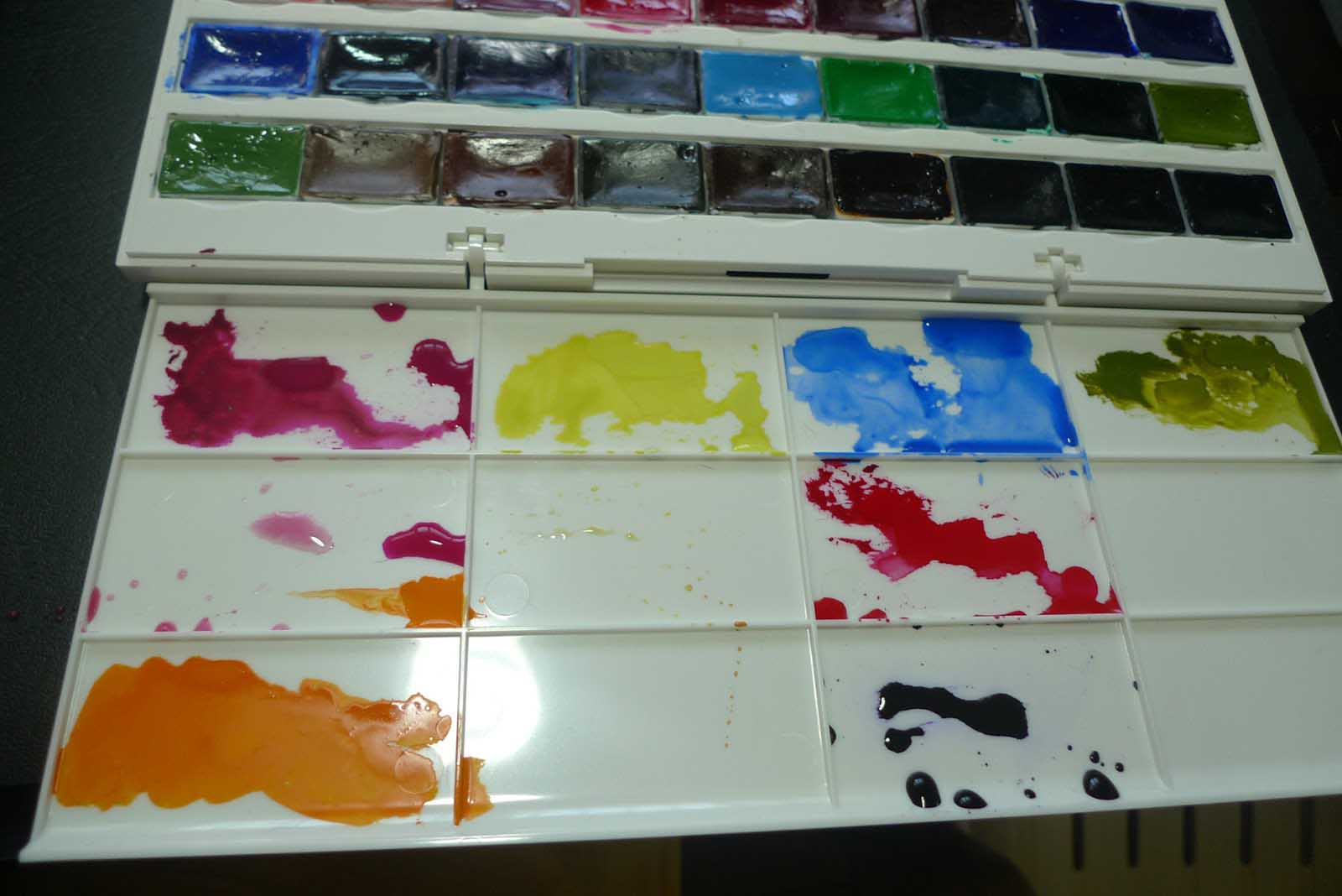
Here, I readied color washes on the palette. But most color combinations, I mix on the paper surface.
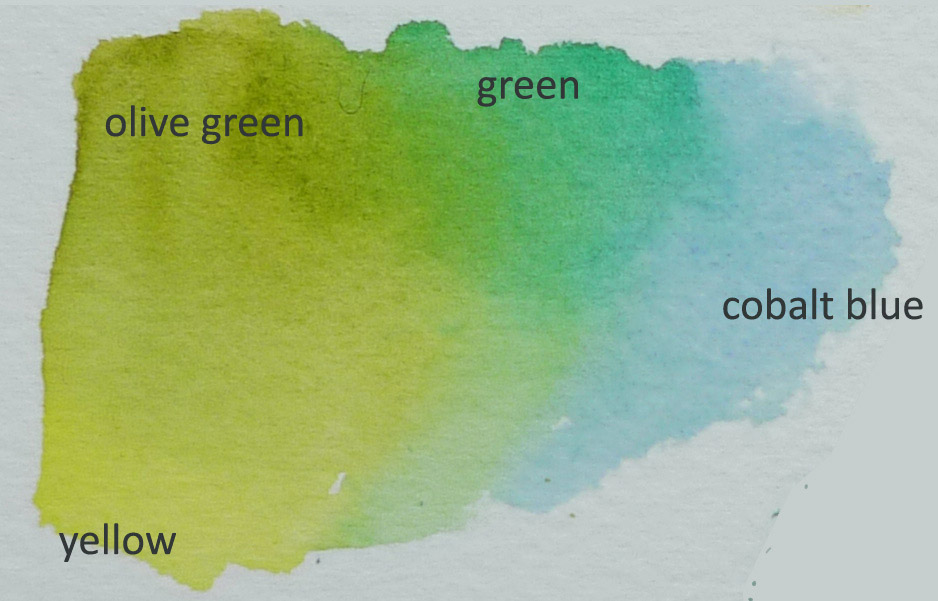
Top row, left to right: quinacridone magenta, cadmium lemon, cobalt blue, olive green.
Mid row: Left well, I transfered some of the quin magenta from the top and some of the color orange (Golden) from the bottom. Right well contains Carmine.
Bottom row: Orange and Violet
I applied light washes all over to help me define and see the flower structures better.
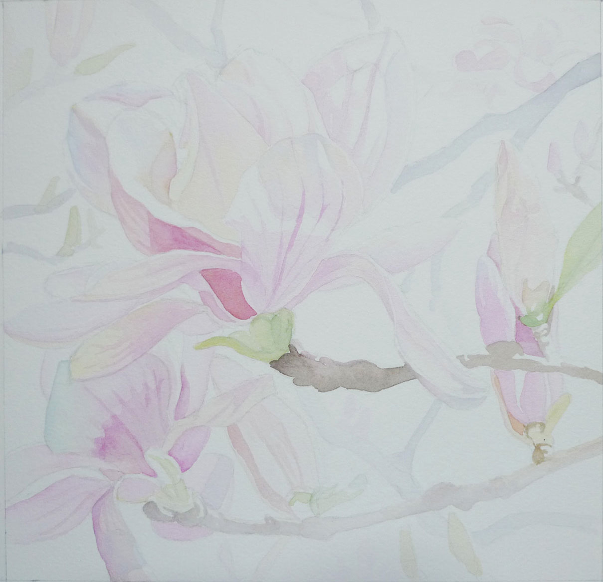
Here, I used a bluish foundation for the branches I would delegate to the background. Same technique used by landscape painters to create a receding effect for distant structures. Blues to push objects back.
Almost done covering all areas.
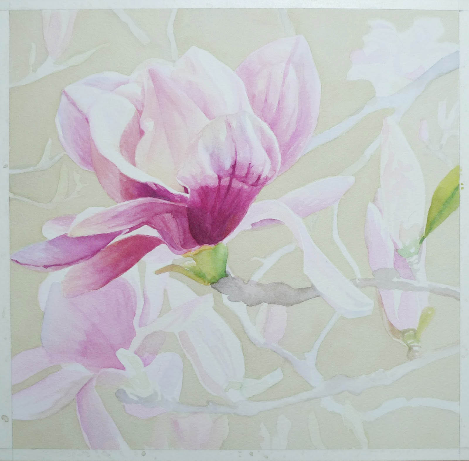
Now we start building up the colors. Observe the differences in values.
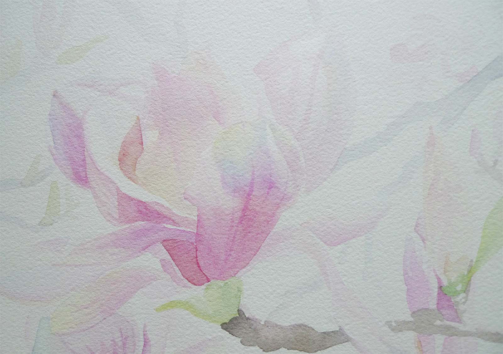
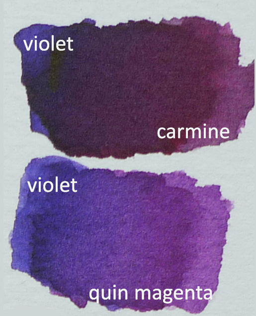
For the darker parts of the flower mix Violet plus Carmine and Violet with Quinacridone Magenta. Calibrate or adjust your mix towards a color if you want it redder or more fuschia or more violety.
Explore your colors. Check out the range you can achieve with just four colors for the green parts.
Once you color the background, the whites pop out. That is still the color of the paper. Because color is relative or is affected by what is next to it, placing darker colors around the leave outs will create the illusion that these are colored white.
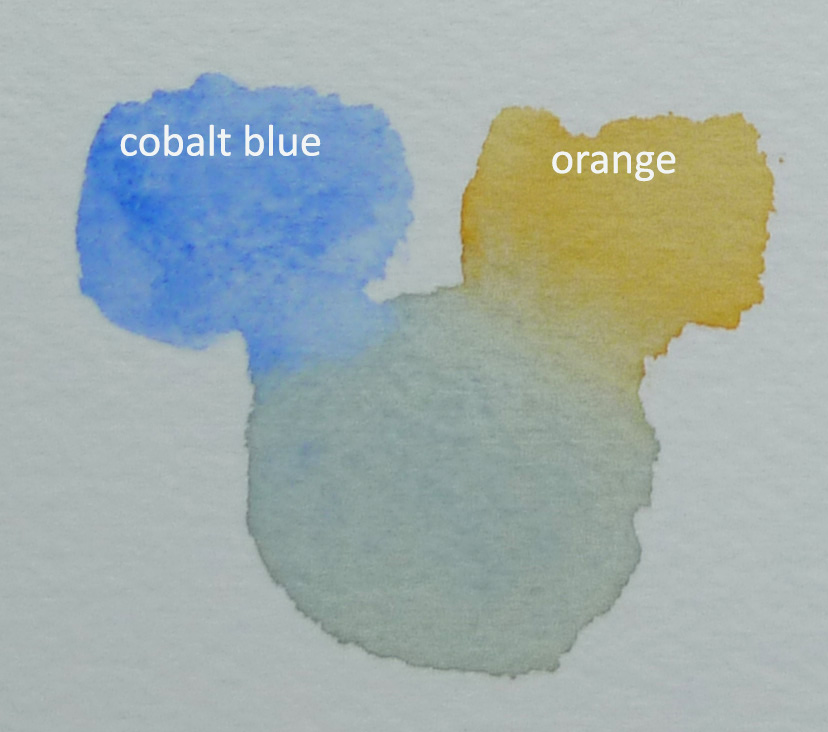
Beautiful neutrals or grays can be made from complementary colors. Here cobalt blue and orange was mixed to create gray. You can make this neutral warmer or cooler by taking it towards orange or blue.
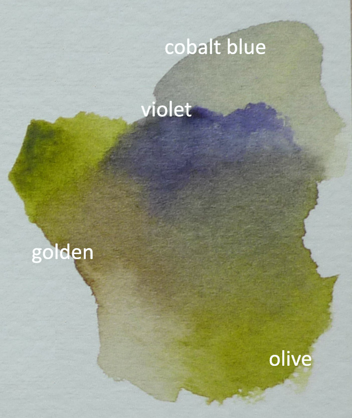
Sometimes, you can find the right neutral with mixes from more than two colors.
I used quinacridone magenta, a bit of violet, a bit of carmine for the darker parts of the bloom.
I try to do the focal flower first. It helps me decide better on how to tackle the supporting blooms.
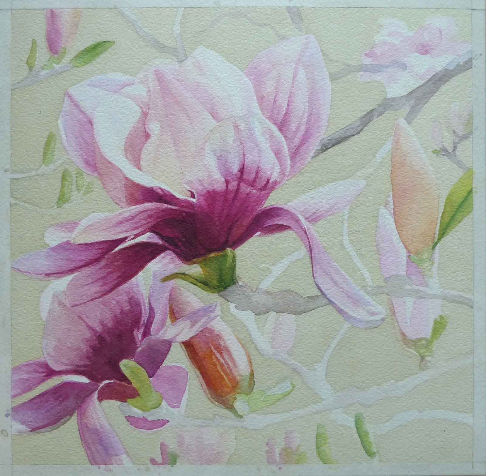
Dry brush to put details on some petals.
I step back a bit to check on how I am doing.
After the values and colors were established for my main bloom, I worked on the supporting cast. As with plays and movies, your support should not outshine your star so less of everything for them. Less details. Less color intensity.
A habit I developed from working with tube colors and limited palettes. I was mixing black from green and red, trying to get that strong black when I happened to look back at the palette and realized I have all these ready made colors at my disposal and yet I am still doing old school. But between us, I like the neutrals you can create from color mixes better. A favorite black is made from alizarin crimson and phthalo green.
I created my black for the darkest darks of the main bloom from green and carmine. You can vary and move the black towards either color for a more vibrant black. I used the same color for the darks I would use later on the stem.
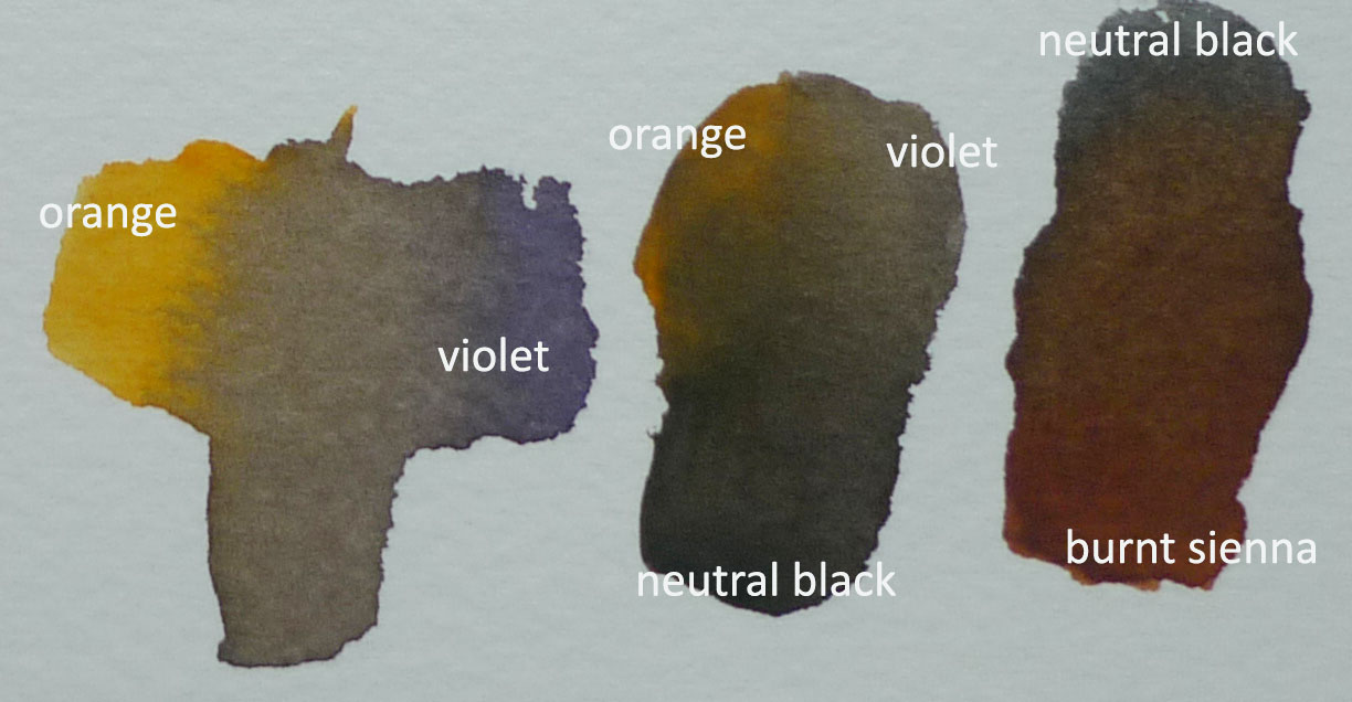
Get a beautiful brown from mixing orange and violet. Experiment. I added Neutral black to this mix (see sample in the middle) to tweak the mix more.
Since I also realized there were ready browns available on the set, i got some burnt sienna and tried to see what type brown can be produced by mixing it with neutral black.
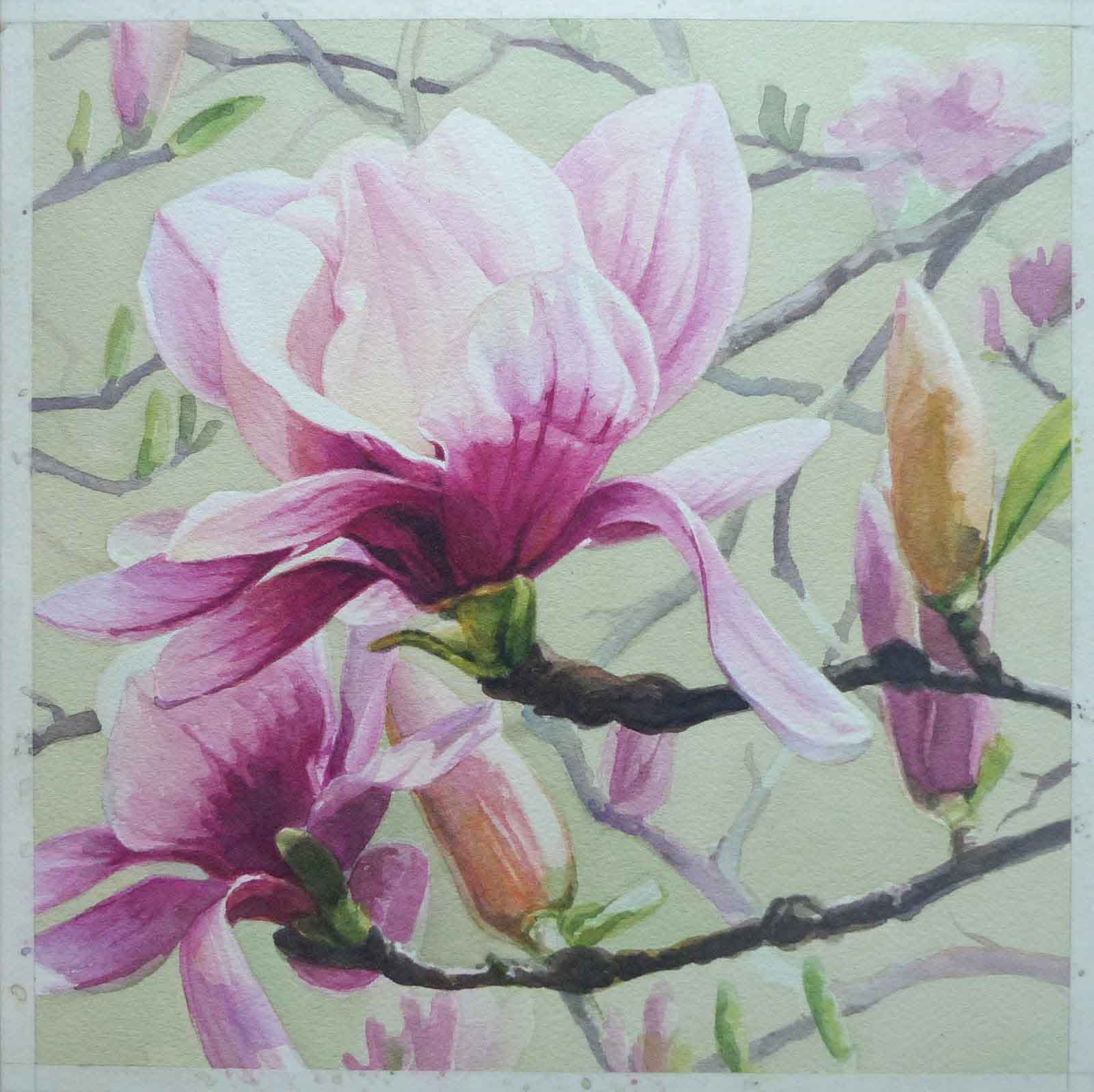
I added the rest of the branches and I think I am done.
Photo looked bluish because I was painting and taking the pics at night using only white light. Took a better shot for my final picture the next day. For better color capture, use natural light.
On Copyrights and Permissions. Observance of copyright is something artists, workshop facilitators and art teachers now try to raise awareness of.
What is a copyright? Copyright is a law granting the creator of an original work the rights over his/her creation. For artists, this means they own not just the original artwork but the image of their artwork as well. This is automatic or is assumed the moment you finish your art but if you want legal documentation to support your claim, this is possible also through patent offices (not cheap). When artists sell an artwork, they are only selling the physical work. The right to the artwork image remains with the artist unless he/she also opts to sell the license to copy which would allow others then to use the image for their own purposes. This is usually done for a very good price.
On limited copyrights. The above demo, which I made specially for those interested to paint this as a learning experience, allows the followers to paint or do a version of this painting. Most tutorials or workshop pieces where students or followers copy an original painting fall under limited copyrights. This means, it is ok to copy for learning purpose, perhaps display at home, gift to friends, but may not be sold or the piece entered in contests.
Some posting guidelines for works done in workshops or tutorials.
Give credit to the original artist. When posting your finished artwork, give credit or name the artist the work is copied from. A line saying this is my work from a demo or tutorial by ______ should suffice. Specially with artists and other professionals being very keen on combating plagiarism, this can be your protection when you share your work publicly.
Personal use only. Not for commercial use. You may display the artwork in your home or even gift them to friends (tell them it is not an original though – done from a tutorial). Enjoy it. However, do not sell, publish in print or market works copied from an original by another artist. This is to respect the original artist and recognize the hard work that went into conceptualizing and executing the original piece.
Not for entry in juried shows. While many if not all organizers now make it a point to include this caution in the rules, even when not stated particularly, ethics dictate that no artwork produced from a workshop with the image a copy of an artwork done by the instructor be entered into a juried show. Again, to respect the original creator and the effort that went into conceptualizing and executing the original work.
Ask permission . If you plan on using the artwork for a purpose or situation not stated above, it is always a good practice to ask permission. You may find most artists are accommodating.
Please help spread the info so we can improve ethical practices in the arts.