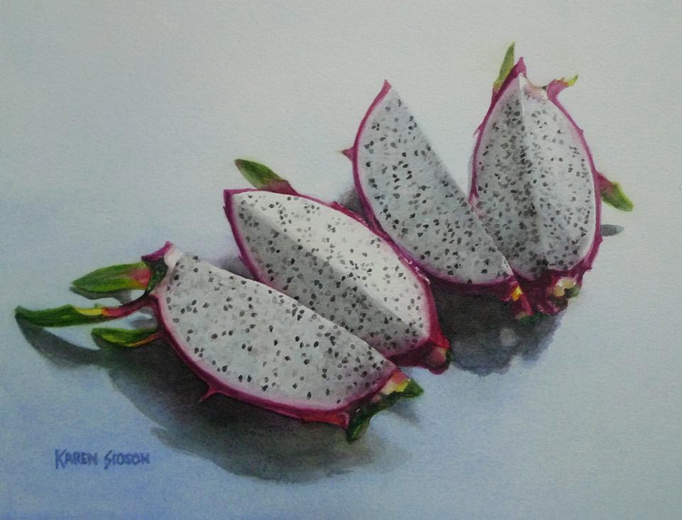
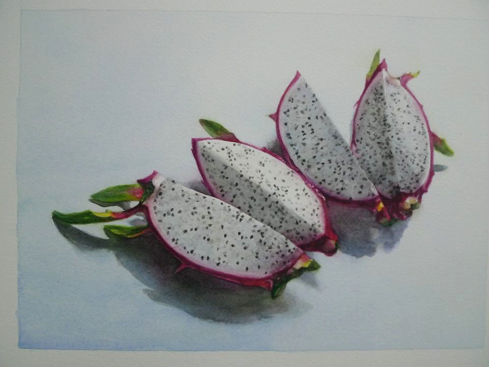
This article shows how I created the dragon fruit painting. This is not meant as a paint along tutorial but more of a progression demo meant to share only my painting process and tips for correcting mistakes.
Colors used:
Winsor lemon permanent sap green Winsor green cobalt blue ivory black permanent rose permanent alizarin crimson permanent magenta
paper: Arches 140 lb cold press watercolor paper
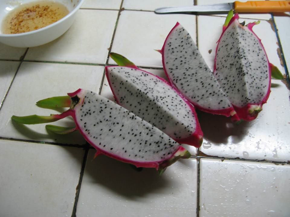
Photo reference taken in a hurry. Those supposed to be staying away from the sweets (diabetics) were impatient to get the subject back.
Light source was CFL over the sink.
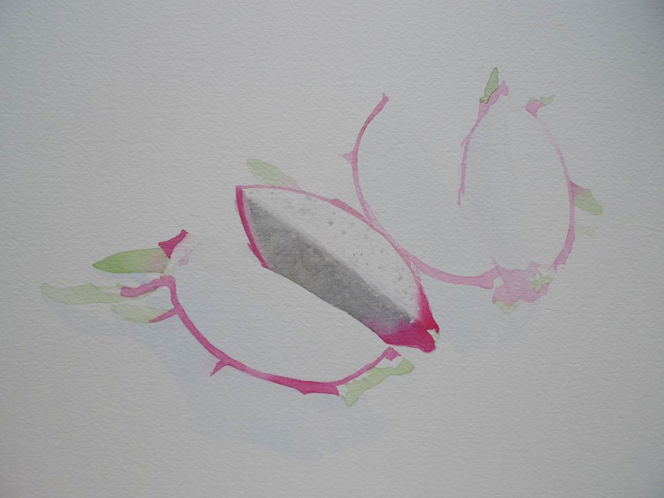
I drew the forms with light pencil and later blocked in colors with light washes. This allowed me to erase the pencil lines afterwards and retain my guide. I do this because graphite can dirty colors specially the yellows making them take on a greenish cast. Some like how the pencil lines add structure to the watercolors though.
Colors used at this stage: Permanent sap green, permanent rose, ivory black, cobalt blue.
You are probably wondering what I was doing here. Gravity can be a tool too. You can create textures with the help of gravity. I have observed before that WN Ivory black when applied as a wash can get uneven easily if you disturb the wash while it is drying. Sometimes what can be an annoying or unwanted result can be turned around and become a useful trick. This helped create the base for the “cookies and creme” texture of the fruit flesh.
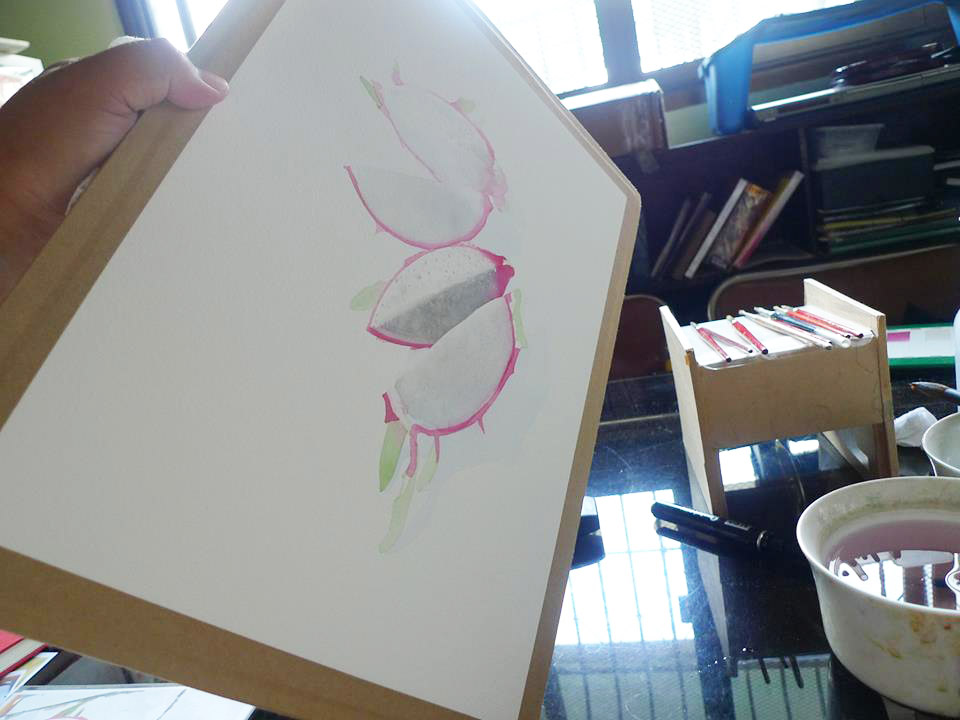
There are different ways to paint watercolor. Fast and furious or (for OCs like me) you can layer to your hearts content until you get the look that you want.
I often would jump from area to area while waiting for previous applications to dry.
Colors used at this point are Winsor Lemon, permanent sap green, permanent rose, ivory black and cobalt blue.
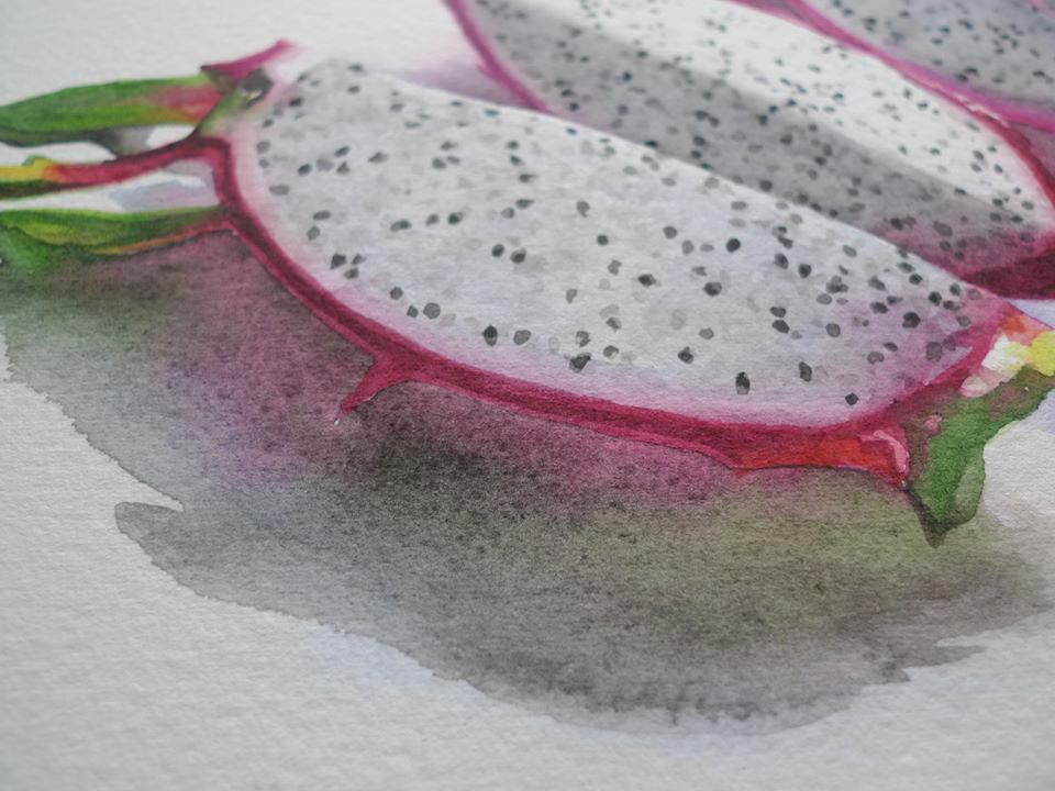
Notice how my first layer for the cast shadow is full of color. I always work mindful of reflected colors.
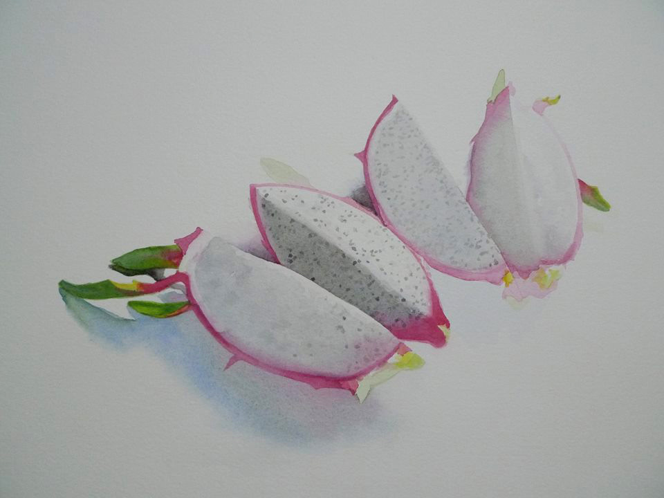
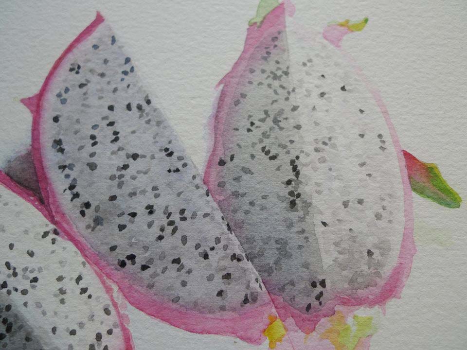
To finish the “cookies and cream” look of the fruit flesh, I added the light, middle and finally the dark seeds and used my reference photo to get an idea on how the seeds are spread out. I focused more on the values and temperature of the surfaces than meticulously copying the seed placement.
My photo reference was taken indoor and under artificial light but I wanted the fruit to look like it was painted outside under natural light.
I used this guide for achieving that look. Areas facing the light source are warm. The surfaces that face the sky but do not get directly hit by the light source are cooler hence the bluish tint.
Here, the second layer of the cast shadow was painted with ivory black. Look at how it lets the previous layer shine through. I did not try to correct the application. Some unevenness can be beautiful.
I varied the outer skin color with bits of permanent magenta (looks like fuschia with a touch more violet in it) and with permanent alizarin crimson (more dark reddish fuschia). Aside from Ivory black, I also mixed a black from permanent alizarin crimson and Winsor green. Ivory black is a warm and light black while the black resulting from the permanent alizarin crimson and Winsor green mix is inky. I used it for the very dark areas. A beautiful brown can be mixed from permanent sap green and permanent alizarin crimson.
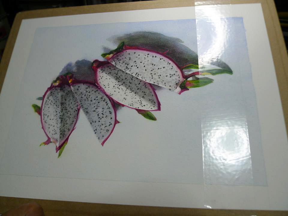
I toned down the white background and anchored the subject down by placing a gradated cobalt blue wash on the background. Lighter where the light is supposed to be coming from. Darker near the left bottom corner.
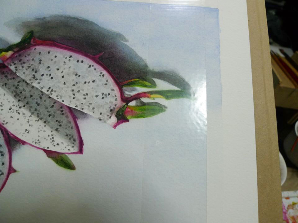
Of course I realized that after placing the wash, I just defined a very big empty area on the upper left. I should have used something colored like paper strips to frame and better visualize the resulting painted area instead of just lightly penciling in the boundary.
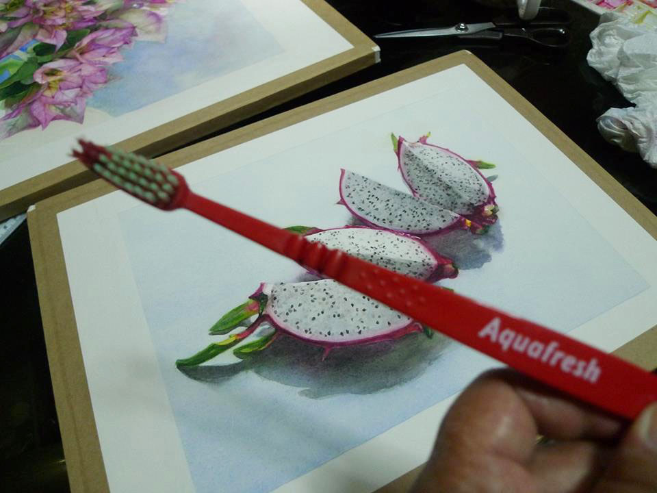
I can not remember the brand but this is a transparent acid free tape used by artists to help keep the edges or margins of the paper clean while you work on your painting. I rarely use this as I try to save the tape. Artist tapes were not available in the Philippines several years ago. This one was sent by my friend, Rowena from abroad.
See how it fades watercolor mistakes magically.
Kidding. I used a toothbrush to scrub the area clean to erase the part that I did not like. The tape protected the area I wanted to preserve. I scrubbed away from the tape so as not to push water under the tape. I made sure to blot immediately with clean tissue so freed pigments do not have a chance to work its way back into the paper’s fibers.
Yes, it is okay to use tooth brush on watercolor paper as long as you are working on cold pressed or rough paper because you guessed it, those paper have “tooth”. 😀
Arches is a tough paper though so it could take this abuse without getting damaged. If you are planning to scrub mistakes with a toothbrush or with any stiff artist brush, be sure to test first on a scrap of that type paper before doing on the painting itself.
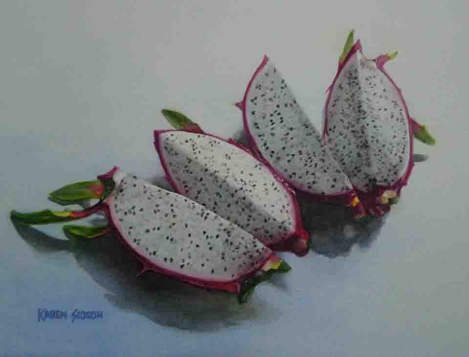
I was able to get the white of the paper back. Actually this part, I could have just hidden behind the mat. No need to erase. But for my peace of mind, I wanted it corrected before I sign it finished.